The Importance of Mobile Optimisation in 2019
With smartphones today anyone can quickly load up a webpage, get directions, conduct product research, and even manage their banking—all in a matter of minutes. Smartphones are now so ubiquitous that you would be hard pressed to find anyone without one. **Why does this matter?**


Because consumers are increasingly shifting their attention (and spending) on mobile devices. That trend is likely to continue well into the future as tech becomes more accessible.
The decision to not prioritise mobile optimisation can potentially cost your bottom line thousands of dollars or more. Mobile optimisation is simply the practice of optimising a site for mobile devices. That means addressing your site design and its overall structure so it’s accessible on smartphones and tablets.
Here we’ll take a closer look at the importance of mobile optimisation and what you can do today to design a better mobile experience for your users.
Global Traffic on Mobile Devices Has Surpassed Desktop Traffic
Smartphones have seen explosive growth over the last decade. So much, in fact, that traffic on mobile devices now exceeds desktop traffic worldwide according to data from StatCounter.
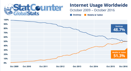
If you wanted to make a purchase online or search for a local business, you were mostly limited to a desktop device. Mobile devices were too clunky at the time. But more capable smartphones and better networking technology has caused a major shift in how consumers access the web as seen here.
Bottom line: Just having a desktop version of your website won’t cut it anymore.
Mobile-Friendliness is Now a Major Ranking Factor
The exponential growth of mobile adoption changed how people access—and search—the web. To make it easier for users to find pages optimised for their devices, Google released a major update to its algorithm that makes mobile-friendliness a ranking factor. All factors being equal, a site optimised for mobile will outrank its non-mobile-friendly counterpart in the search results.
Google has placed even more priority on mobile optimisation with its mobile-first index. Instead of indexing the desktop version of a site, Google now predominantly indexes and ranks the mobile version of a site for all search queries.
Not prioritising mobile optimisation means lower rankings and search engine traffic.
Mobile Increases User Engagement
It’s happened to all of us: You land a site but it’s not optimised for your devices. Just to read the text you have to pinch and zoom. Even navigating through the site is a chore as the links are so close to each other that you cannot easily tap on the right one. Rather than remain on the page, you bounce out and tap through a different search result.
This scenario isn’t that uncommon. Consumers may have been tolerant of poorly optimised sites in the past but that’s no longer the case now. Optimising your website for mobile devices means higher user engagement and lower bounce rates.
Consumers Search for Local Businesses on Mobile
Think about how you found the last local business you visited. Chances are that you found it with a quick online search and got driving directions from your smartphone.
You’re not alone as consumers increasingly use Google to search for local businesses with most queries occurring on smartphones. For mobile searches on the go, users want answers immediately and will not hesitate to leave a webpage if they don’t find what they’re looking for. Mobile optimisation is crucial especially if your business targets local customers.
Increased Sales and Conversions Online
You’re not doing your business any favours if your site is difficult to navigate on mobile devices. In fact, you’re making it much harder for your visitors to buy from you.
Data from Google found that users are more likely to buy a product or service if the site was optimised for their device. In contrast, users who landed on a poorly optimised site were left with a negative impression and were more likely to leave.
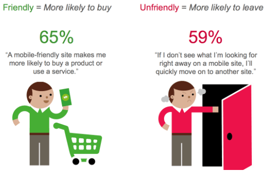
Without mobile optimisation, you risk alienating your visitors and losing out on potential sales.
Now that you understand the importance of a mobile-friendly site, here’s what you can do to design a better browsing experience for your users:
- Make your site responsive:
Responsive design is based on a grid-like structure that automatically adjusts its layout to fit all screen sizes. It’s also Google’s recommended mobile configuration. - Improve loading times:
Mobile users don’t have the patience to wait around for a page to load. Optimise your images, enable browser caching, and reduce response times to improve site speed. - Avoid using Flash:
Flash may have been popular but it’s now largely obsolete. Instead, use HTML5 or Java as an alternative to Flash. - Prioritise content above the fold:
Make it easy for your mobile users to find what they’re looking for without having to scroll through pages and pages.
As mobile usage continues to grow, businesses must learn to adapt or they risk losing a major competitive advantage. The good news is that it’s not too late. Start with the steps outlined above to optimise your site for mobile devices.
Let's have a chat to explore how we can optimise your website for higher traffic and conversions!
Topics
mobile
business
marketing
advertising
strategy
startup
optimisation
creative
digital
Share