Upparel
Branding • Growth • Digital Product
After being blown away by the amount of textile waste and pivoting to a direct-to-consumer textile recycling scheme, Upparel came to us with a new name and the idea of rebranding to reflect their new direction and journey thus far.
An ambitious client with the future in mind, the challenge was building an exceptional brand that broke out of the clutter whilst leveraging brand assets to enable growth. Knowing their success would largely depend on partnerships, we had to be instrumental in building a brand with strong co-branding capabilities, adaptability and versatility.
Our Solution
Brand
UPPAREL is dynamic and impactful, shown in their bold and bright brand. We developed the idea of “hitting the pause button” to take a moment to examine our consumerism habits and reinvent the system.
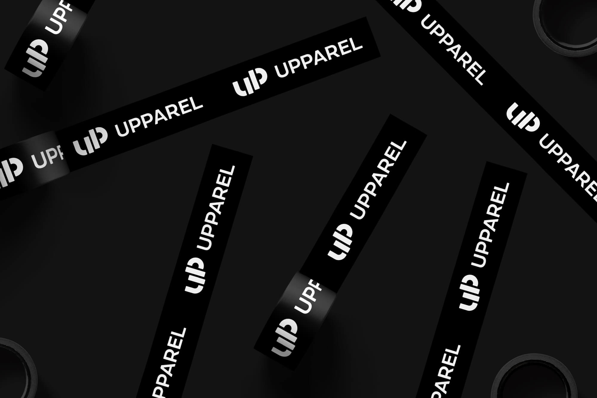
We incorporated the pause icon into the main design of the logo and utilised bold, large shapes into the brand elements adding versatility and ease of use across a range of applications. The brand represents the style of UPPAREL’s innerwear products – successfully adapted to various applications including a pop-up store and kids flip out sofa named FlipUP™.
Logo
UPPAREL’s logo is the hero. The brand elements utilised the logo’s shapes to create dynamic patterns, density and sizes to be versatile and easy-to-use across different applications. The brand is aligned, representing the products to show that recycled textiles don’t have to be boring.
The design takes into account the user experience and encourages positive experiences with the brand from seeing an ad or visiting the website, to making a purchase or upcycling. At every interaction with the customer, the brand image is relevant and prominent to reinforce the promise of being a leader in sustainability and the circular economy.
Visuals of work
We used elements of colour, texture, size and space – carefully blended together to create a design that tells a story. We wanted to be loud and proud with the brand message and that is what we did! The brand is bold, dynamic and impactful, evolving with time, embracing change, being proactive and using actions rather than words to get the message across. We designed custom icons and symbols to illustrate informative data on the impact of textile upcycling. A play on the word “UP” is present throughout the brand – to UPlift, UPcycle, it’s UP to you and shake things UP.
Results
The exciting design solidifies UPPAREL’s position as leaders in the circular fashion and the authority in textile landfill waste solutions. Today, they have increased their customer base, secured over 200 partnerships and solidified their position across all digital and non-digital platforms.

