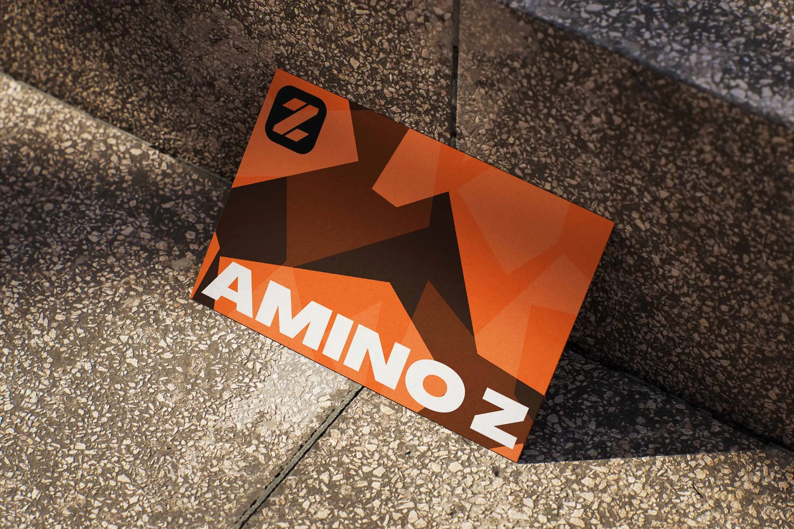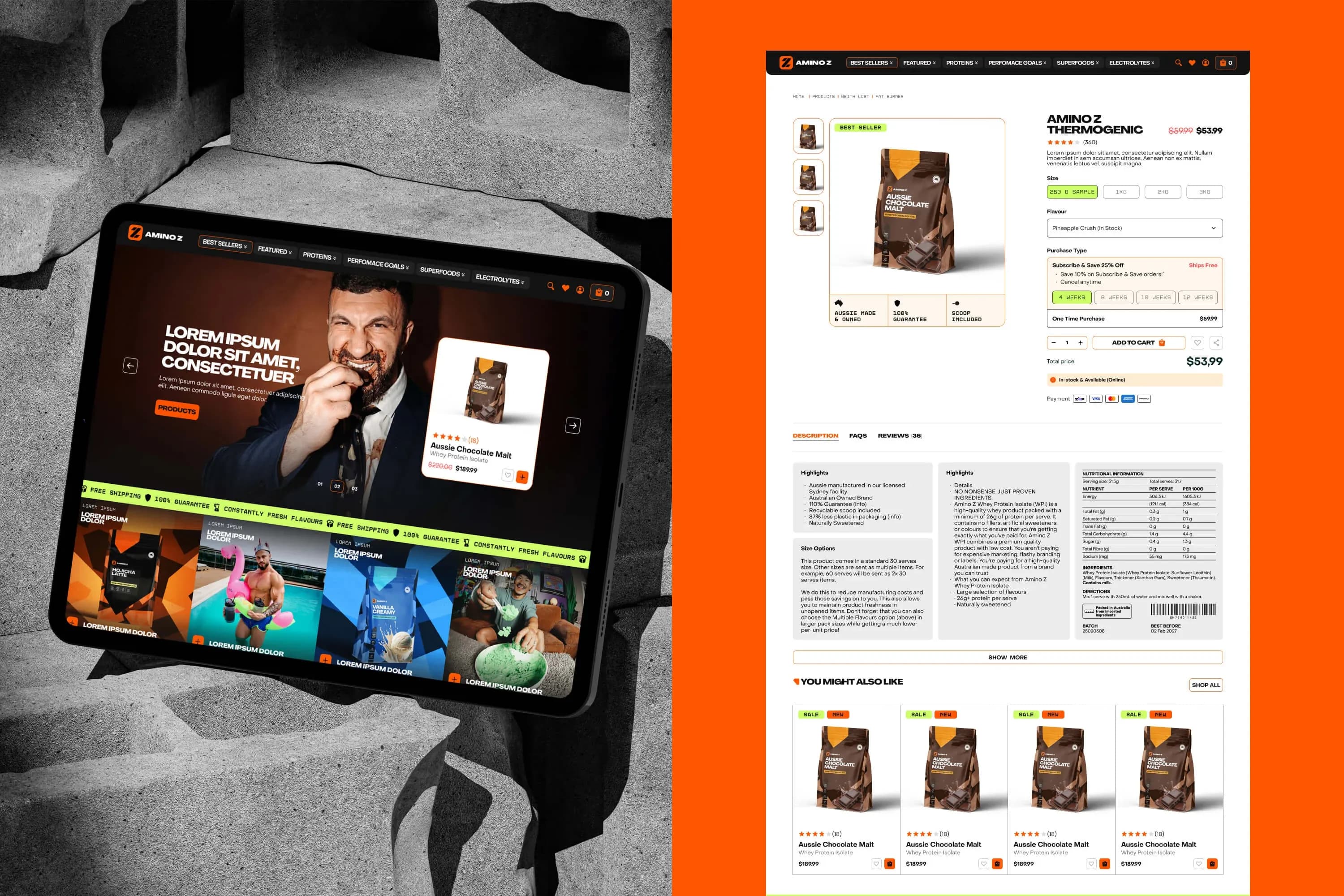
Amino Z
RetailBrand IdentityDesign Systems

Amino Z

Sharper brand guidelines and flavour-led packaging that finally matched the energy and personality already inside the brand.

ClientAmino Z
SectorRetail
EngagementStrategic Delivery
CapabilitiesBrand Identity · Design Systems
The Challenge

The brand had energy, the shelf didn't

Amino Z had a strong identity and a distinctive tone of voice, but its packaging wasn't fully reflecting the energy, flavour and personality behind the brand.

The brief was to sharpen the brand guidelines and build a more eye-catching, flavour-led presence that could hold its own in a competitive retail space, not tweak the packaging in isolation.
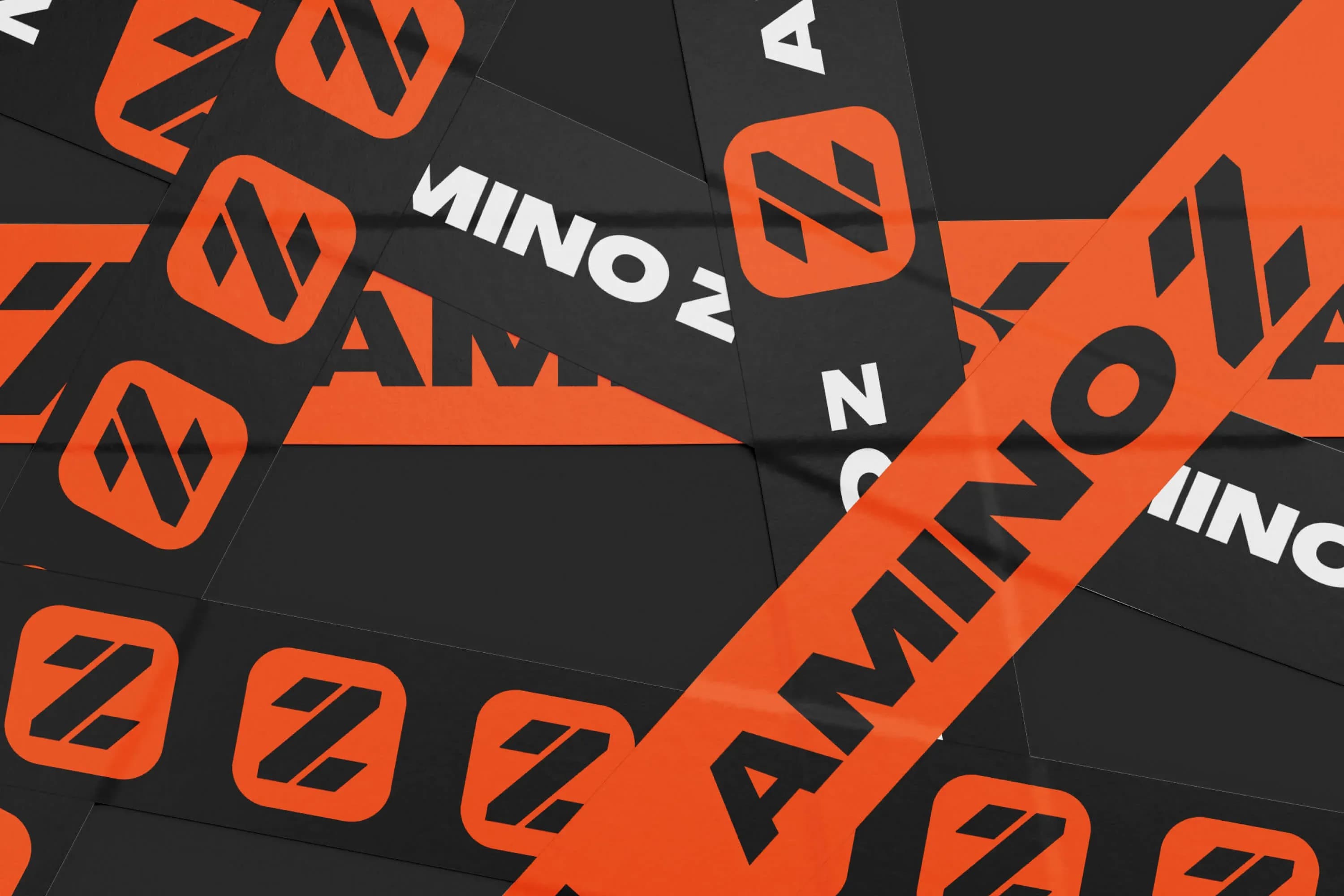
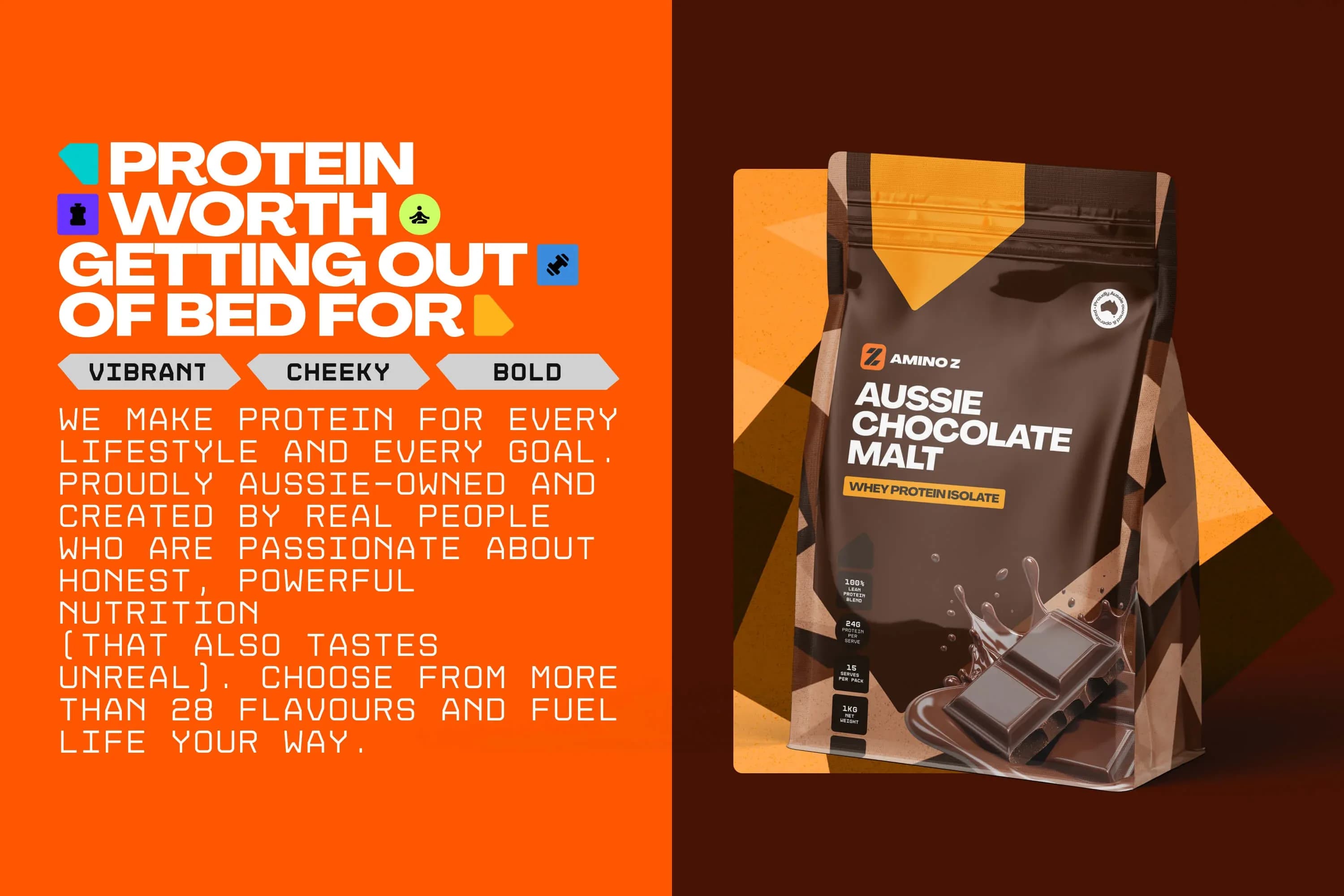
Packaging didn't reflect the energy and personality already present in the brand.

Brand guidelines weren't sharp enough to keep tone of voice and visual expression consistent.

Flavour wasn't cutting through on shelf in a competitive retail category.

What We Did

Guidelines first, then shelf impact

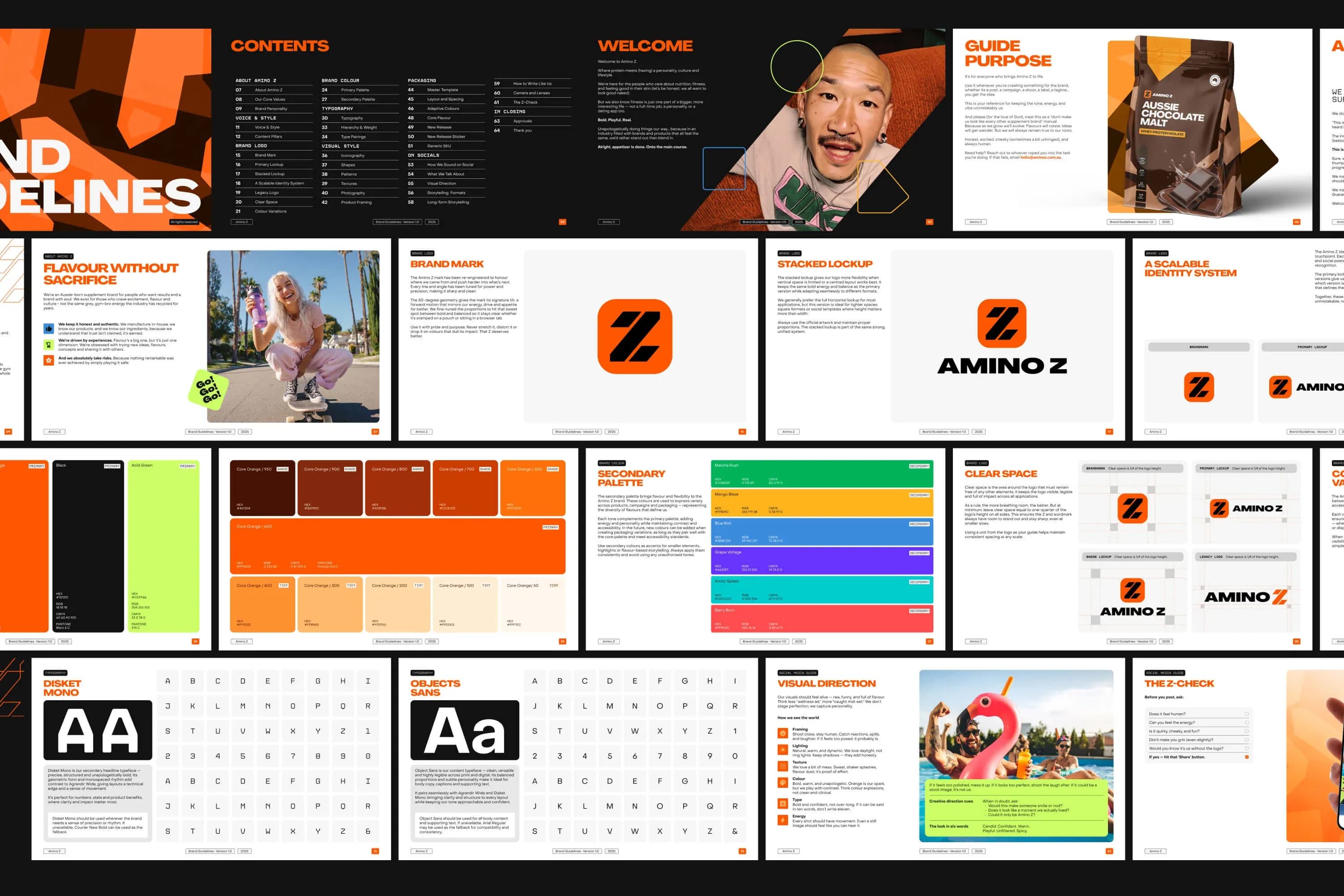
Brand guidelines, clarified.

Phase 1 - Sharpening the system

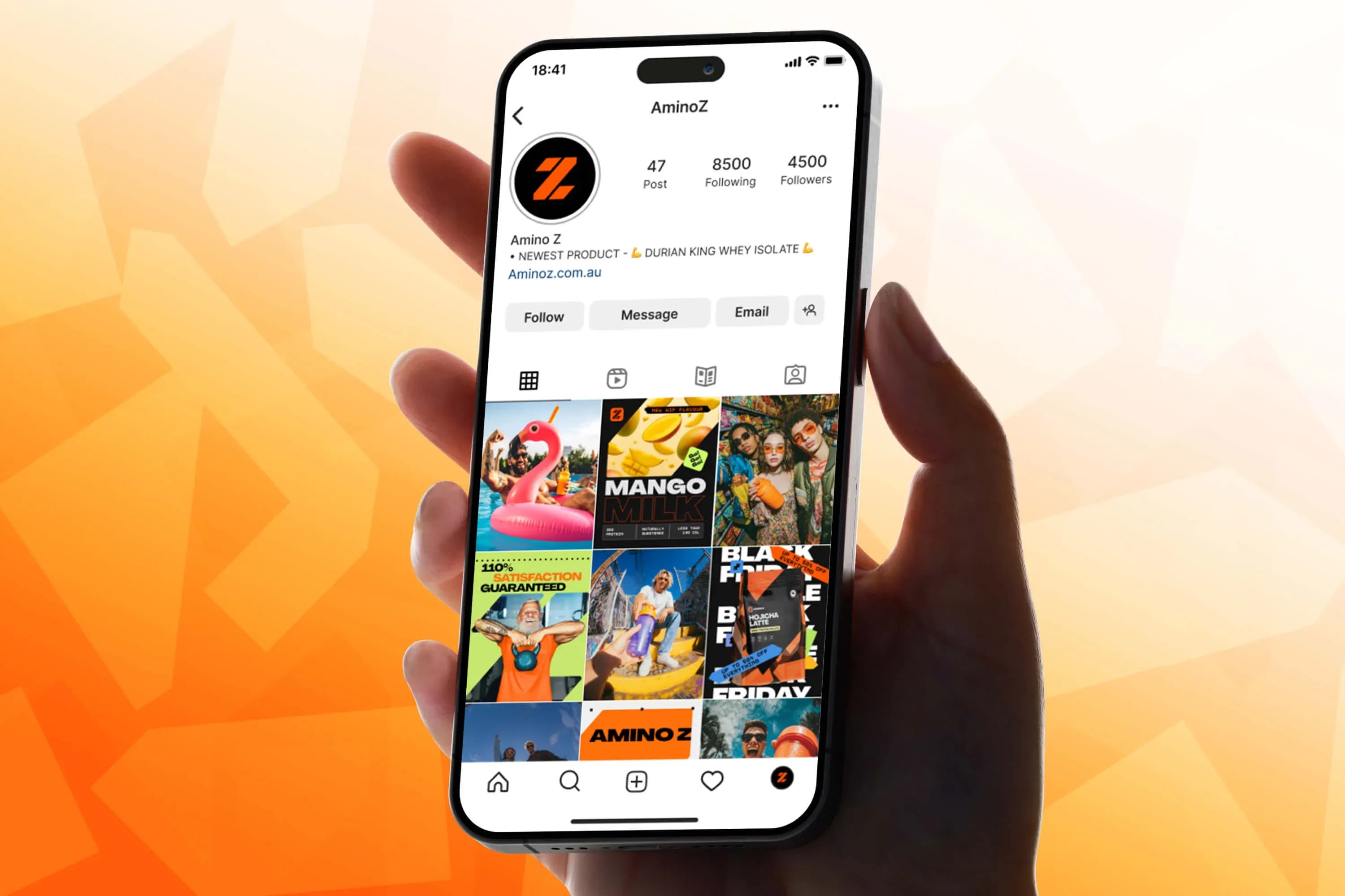
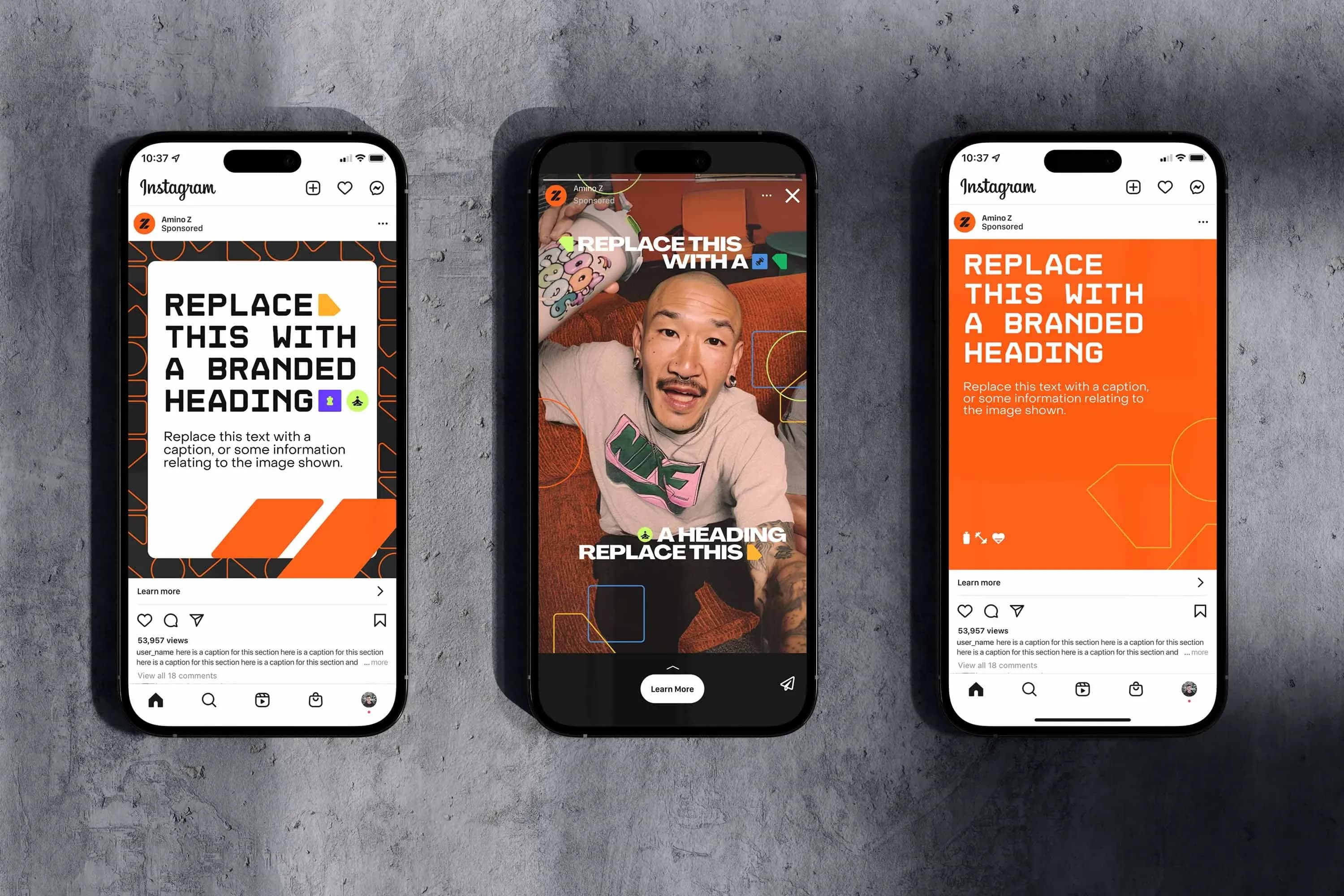
We refined and clarified Amino Z's brand guidelines, sharpening tone of voice, visual consistency and brand expression across every touchpoint.

Phase 2 - Making flavour visible - Packaging that stands out.

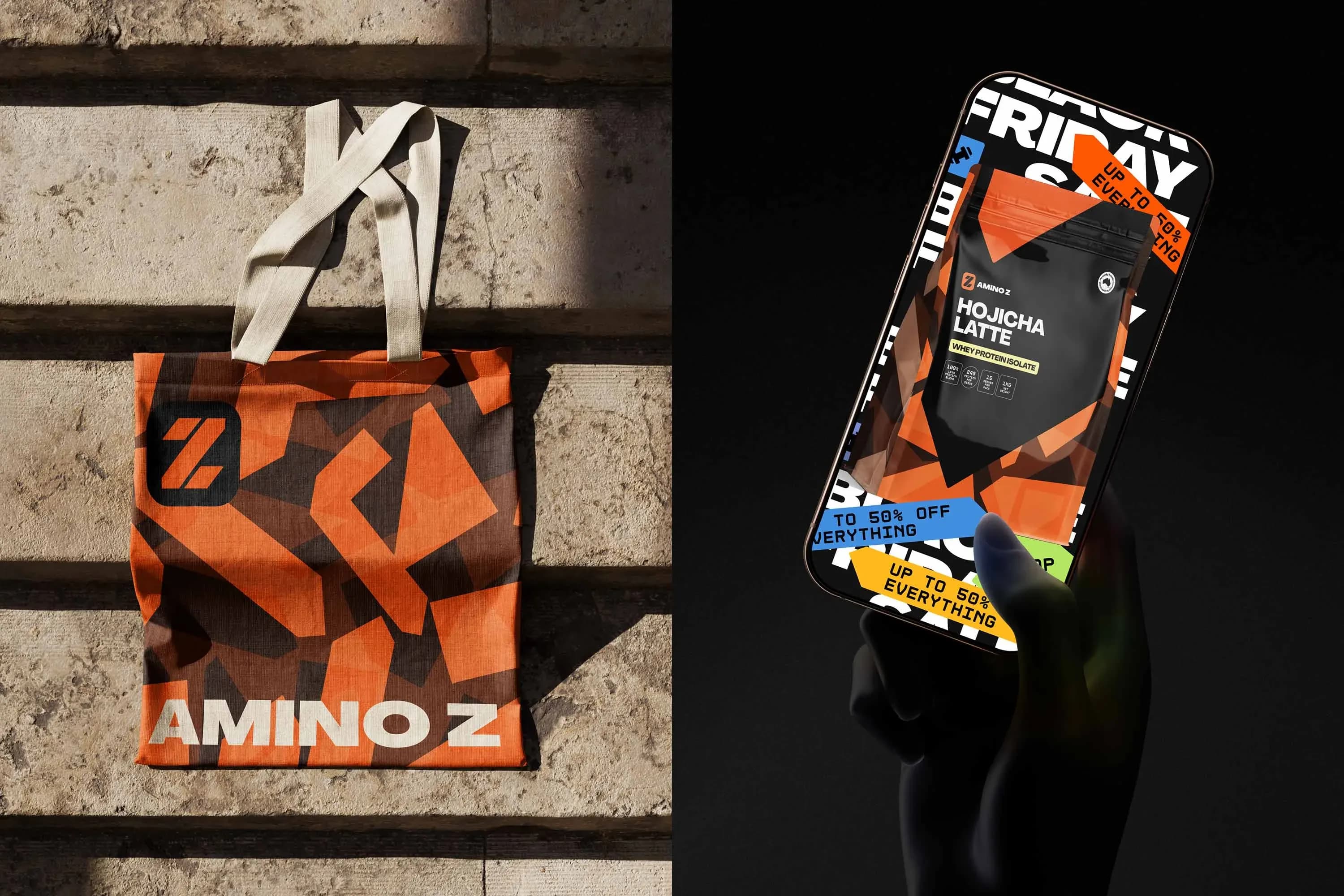
We redesigned the packaging to be more distinctive, vibrant and flavour-focused, helping the products stand out instantly against competitors on a crowded shelf.

Amino Z
Amino Z
Amino Z
Amino Z
Amino Z
Amino Z
Amino Z
The Outcome

Consistent, and impossible to miss

01Stronger brand consistency across every touchpoint.
02Packaging that demands attention on shelf.
03Clearer flavour cues to drive faster purchase decisions.
On My Way
Next Project

On My Way