Future-Ready Means More Than Just Tweaking a Logo to Fit Instagram’s Circle
Heads up ASIC, an updated logo and style guide won’t exactly set you up for the future.
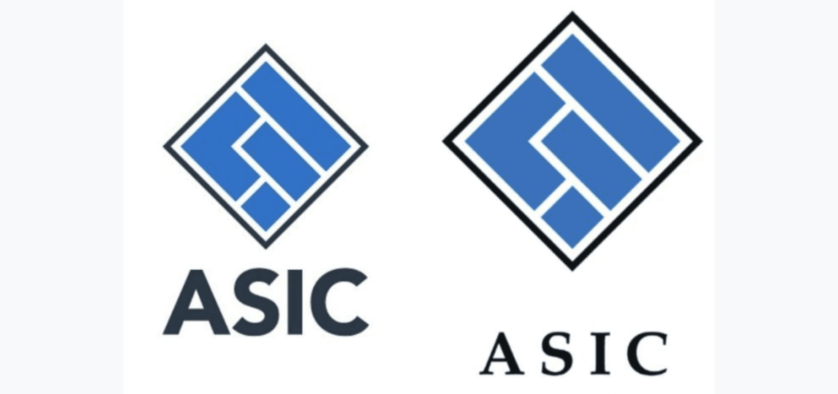
If you haven’t caught it yet, the Australian Securities and Investment Commission recently released a supposedly new design, and to be honest, it’s a bit of a mess. With a vaguely tweaked logo and a different font, you might be left feeling a little underwhelmed … but that’s before you find out how much it cost them.
All reports are pointing at the price being over $100,000, and people have been left a little confused, considering the design has barely changed. According to the ABC, the original design pitch stated “we want the public to be confident”, but we’ve got bad news for you ASIC, the only thing your rebrand is telling us is that you’re a little out of touch.
As the world continues to becoming increasingly digital, many businesses are looking to rebrand themselves to keep up with new technological updates and stay engaged with their customers. Often, this is a vital move for businesses looking to stay relevant – not just for their own wellbeing, but also to ensure they can remain as accessible as possible for their users.
However, the recent debacle surrounding ASIC has revealed an issue that is relatively new to the industry, which has seemed to arise when a company wants to become future-ready without exactly realising what this involves.

ASIC's new logo (left) compared to the previous design
While many media platforms are finding the funny side and asking viewers to spot the difference, the government body has been subsequently slammed by politicians and the general public, calling it a reckless waste of taxpayer funds. However, Matthew Abbott, senior executive leader of corporate affairs at ASIC, has responded claiming the rebrand was necessary, considering the design had not been changed for more than 20 years. “ASIC’s branding update was about making sure ASIC’s materials are suitable for digital channels — and digital is what the people ASIC regulates use,” he said.
And to an extent, Abbott is right. In our increasingly digital world, it is essential that businesses are vigilantly ensuring they are making the most of what the current landscape offers. However, what we’ve seen here is an exorbitant case of a company throwing money at something they think they need, but don’t quite understand. That is, if their understanding of becoming “suitable for digital channels” is just to ensure their logo will be the right dimensions for their social media accounts, it seems like they’ve missed the point entirely.
We believe those looking to update their brands need to be thinking with design-led thinking, which goes a lot further than just creating (or in this case, resizing) graphics and choosing a different style guide. Instead, it’s about acknowledging how and why problems exist, and developing creative solutions and designs that can be integrated into the fabric of the business. On top of this, it’s about challenging old approaches and finding new ways to do things—whether that be embracing new tech like AR or blockchain into your brand, or encouraging innovative thinking while being courageous enough to incorporate daring ideas.
Ultimately, the problem shouldn’t be that ASIC spent $100,000 updating their brand, because the motivation for the redesign is completely legitimate, and something that a lot of businesses really need to be considering as the landscape continues to change. The real issue is that a rebrand like this had the potential to do a lot more than just enhance their public image (if they even achieved that), but advance their processes and improve their accessibility.
Or if we look back at that original pitch again, which asked for the design to mark them as “strong, accountable, firm/fair, finger-on-the-pulse, contemporary [and] informed”—ASIC, maybe next time it would be worth incorporating those qualities in a fundamental way rather than just on a surface level.
If you would like to discover more about Mo Works, connect with us on social media or get in touch.


