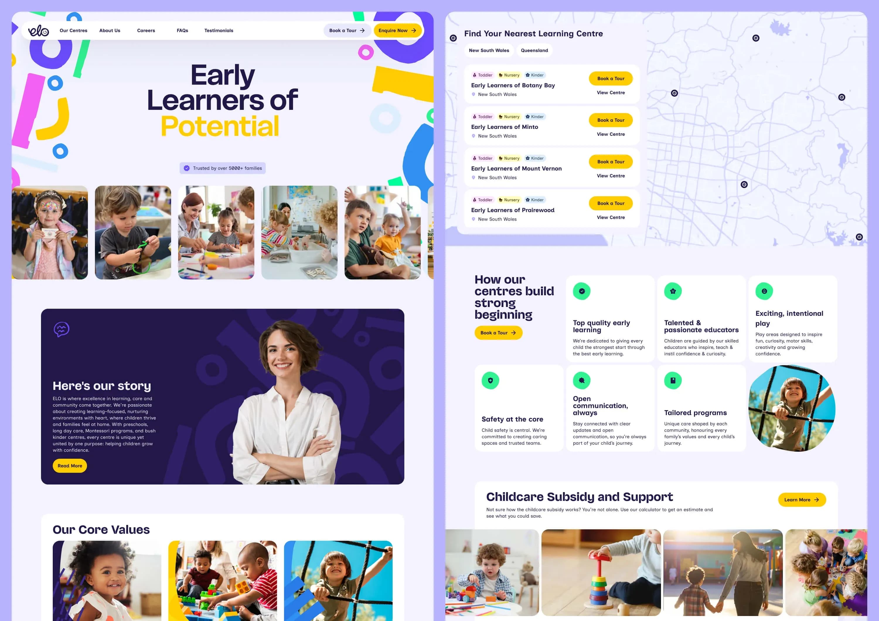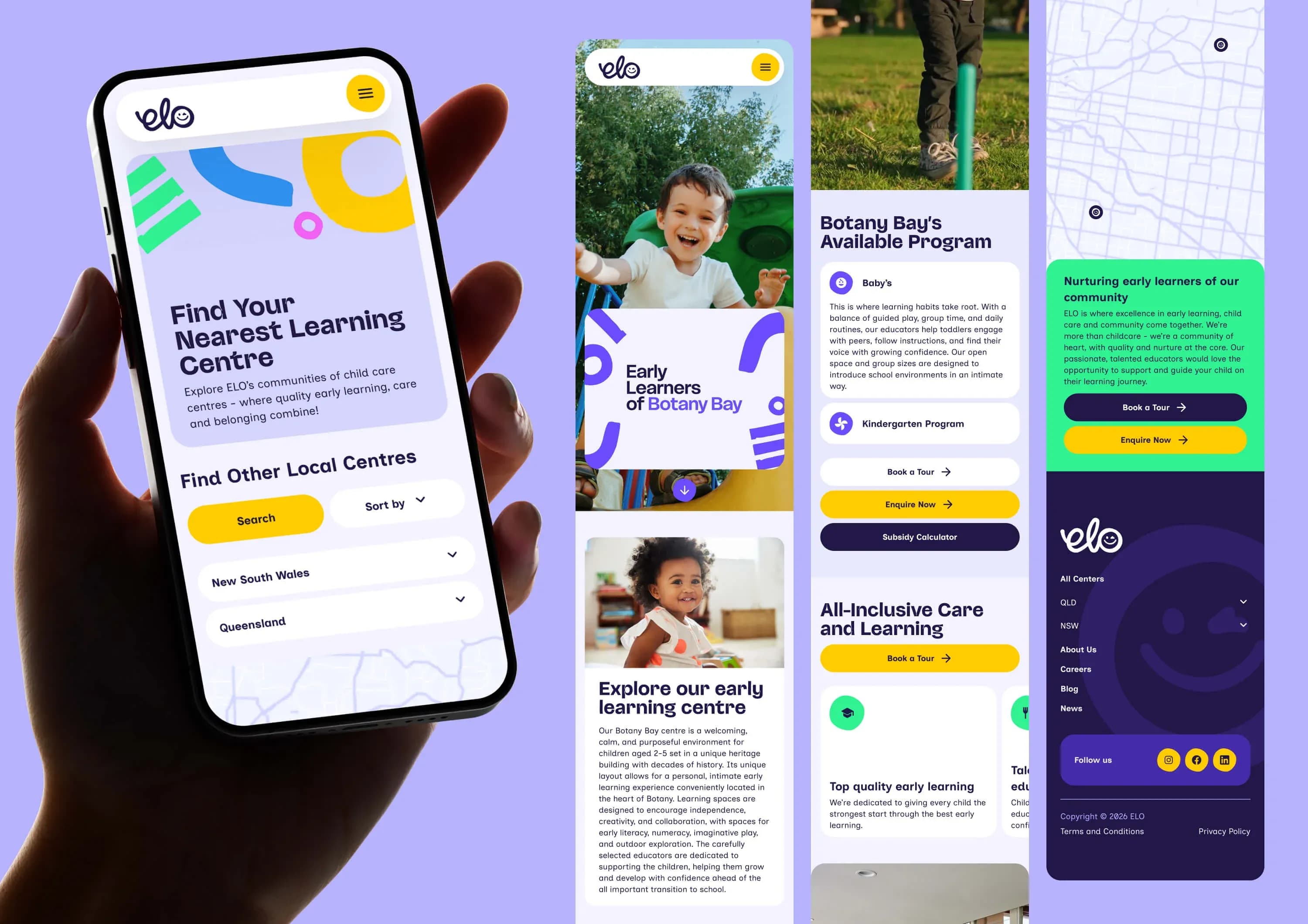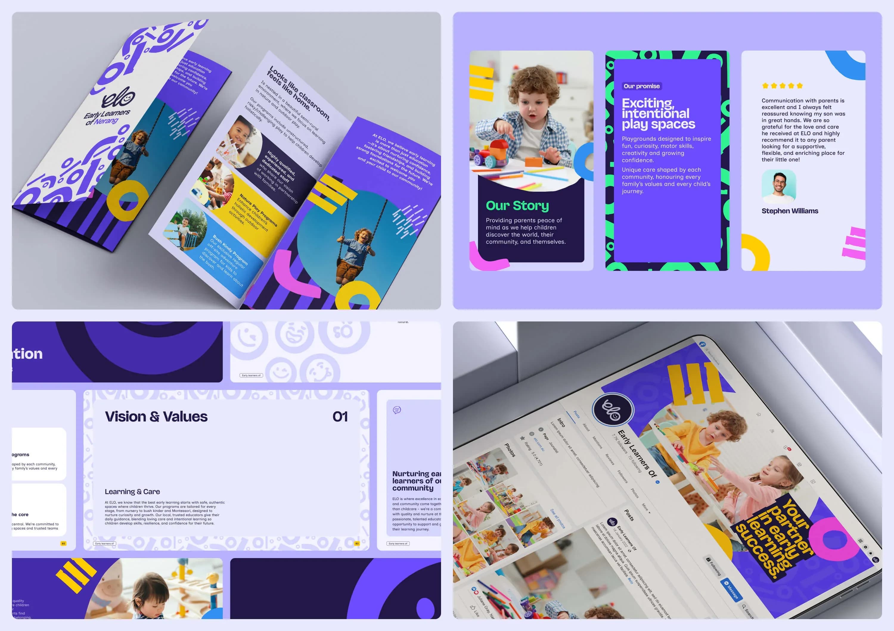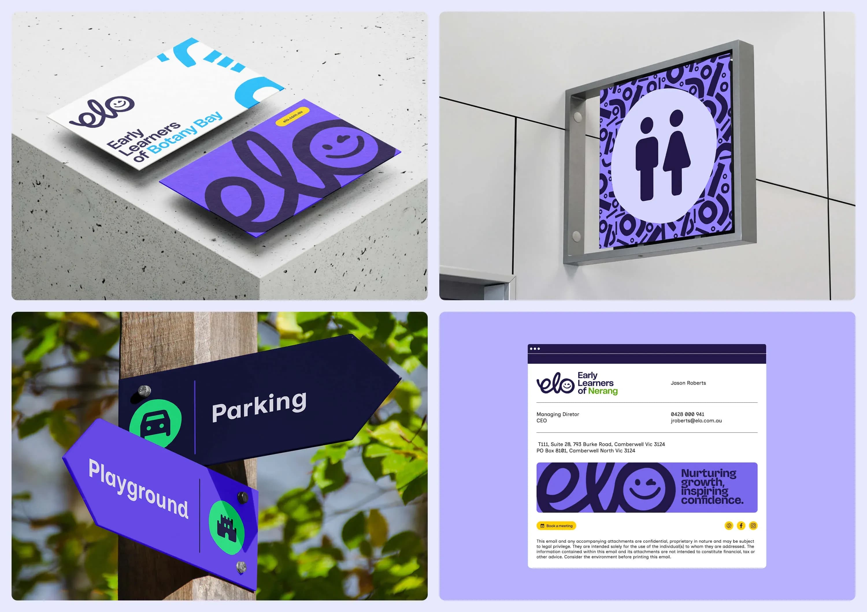
Early Learners of (ELO)
EducationBrand IdentityWeb DesignAutomation

Early Learners of (ELO)

A single brand identity that unified eight early learning centres across two states, warm enough for families and built to scale to more than 50.

ClientEarly Learners of (ELO)
SectorEducation
EngagementStrategic Delivery
CapabilitiesBrand Identity · Web Design · Automation
The Challenge

Eight centres, no shared identity

Early Learners of (ELO) is a growing network of early childhood education centres across Queensland and New South Wales. Each centre had earned real community trust locally, but they shared no visual language, no network recognition and no digital presence worth speaking of.

The brief was to consolidate a fragmented portfolio, from religious iconography to cartoon castles, into one system capable of national expansion, without losing the local warmth each centre had built. It had to speak to an unusually diverse audience of working parents, first-time parents, single-parent families, educators and children. And it had to stand apart from both the efficiency of corporate chains and the limits of under-resourced independents.
Eight centres, several disconnected identities and no shared visual language.

Little network recognition and no digital presence to speak of.

Any move to consolidate risked losing the local warmth and trust each centre had earned.

What We Did

One brand, every centre

ELO, Early Learners Of.

Phase 1 - Start with the name

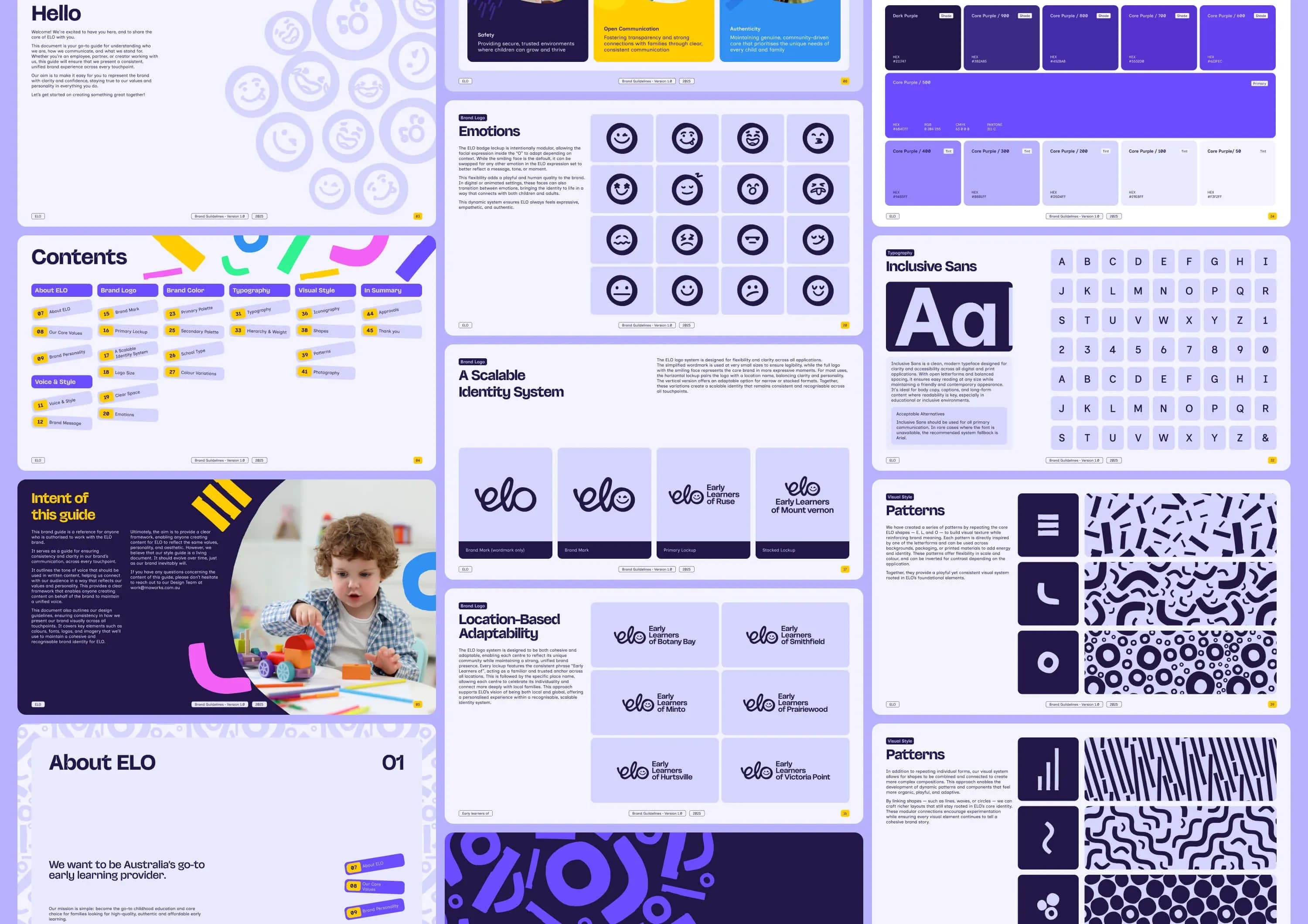
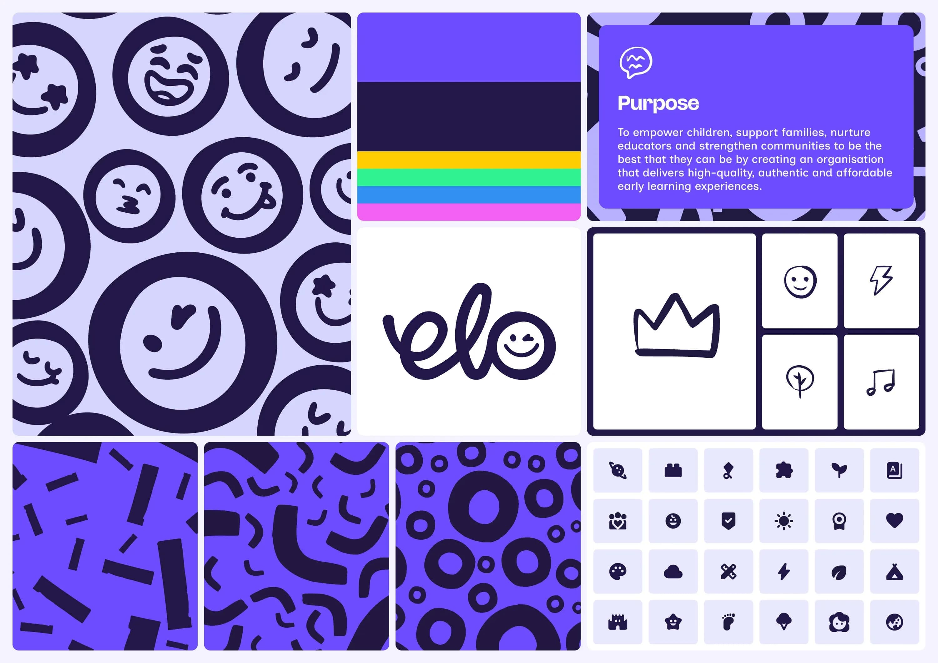
The solution starts with the name: ELO, Early Learners Of. The hand-lettered wordmark carries warmth rather than corporate polish, and its interchangeable "o" becomes a face that expresses the emotional range of early childhood, from curiosity to comfort to joy.

Phase 2 - Meaning in every shape - A system built to mean something.

A secondary shape system carries intent, not just style. The E's three strokes stand for the parent, the child and the educator. The L echoes a boomerang, a nod to Australian identity and community return. The O forms the community circle. Purple, made by merging blue and pink, sets aside gendered convention. Malinton leads headings with character, while Inclusive Sans, designed for legibility in education, carries body copy with clarity.

Phase 3 - Built to scale - A sub-brand for every suburb.

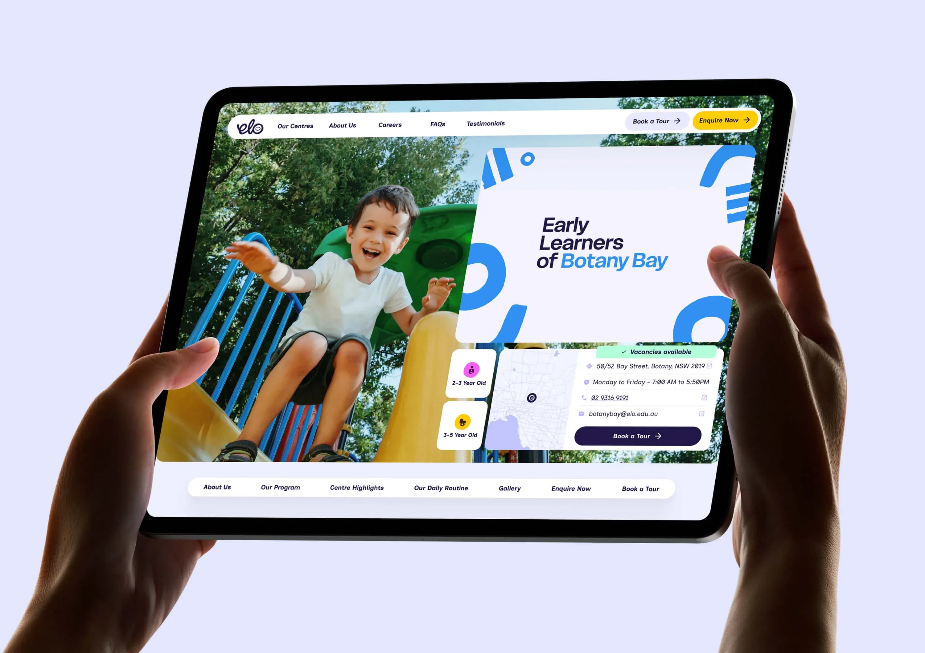
Each centre becomes Early Learners of its suburb, with the suburb name set in its school-type colour, whether Teaching-focused, Traditional Long Day Care, Bush Kinder or Faith-Based. Two guides, Brand Guidelines and Physical Centre Guidelines, let staff who are not designers apply the system consistently across digital, print, wayfinding, uniforms and signage.

Early Learners of (ELO)
The Outcome

Live, trusted, built to grow

8Centres now live under one consistent ELO identity.
5000+Families that trust the ELO network.
50+Centres the brand architecture is built to scale to.
PwC Assess
Next Project

PwC Assess