Click n Collect
B2B EnterpriseUX/UI DesignWeb DesignCustomer PortalsApp Development

Click n Collect

A full UX and UI redesign of the smart-locker platform across four user types, plus the website, buyer's guides and CRM to match, so a fast-growing product is as clear to use as it is to sell.

ClientClick n Collect
SectorB2B Enterprise
EngagementStrategic Delivery
CapabilitiesUX/UI Design · Web Design · Customer Portals · App Development
The Challenge

Growth outpaced the experience

Click n Collect provides smart-locker software to major retailers and logistics partners. It is a complex product: one platform serving four very different users at once, the customer collecting a parcel, the courier making a drop, the store staff running the floor, and the admin managing it all behind the scenes.

As the platform and customer base grew, the digital ecosystem around it had not kept pace. The product UI, the website and the sales materials all needed clearer structure, stronger branding and better accessibility. This was never a reskin. Click n Collect needed the underlying user flows simplified, and the way the product is experienced and sold brought up to the standard of the technology itself.
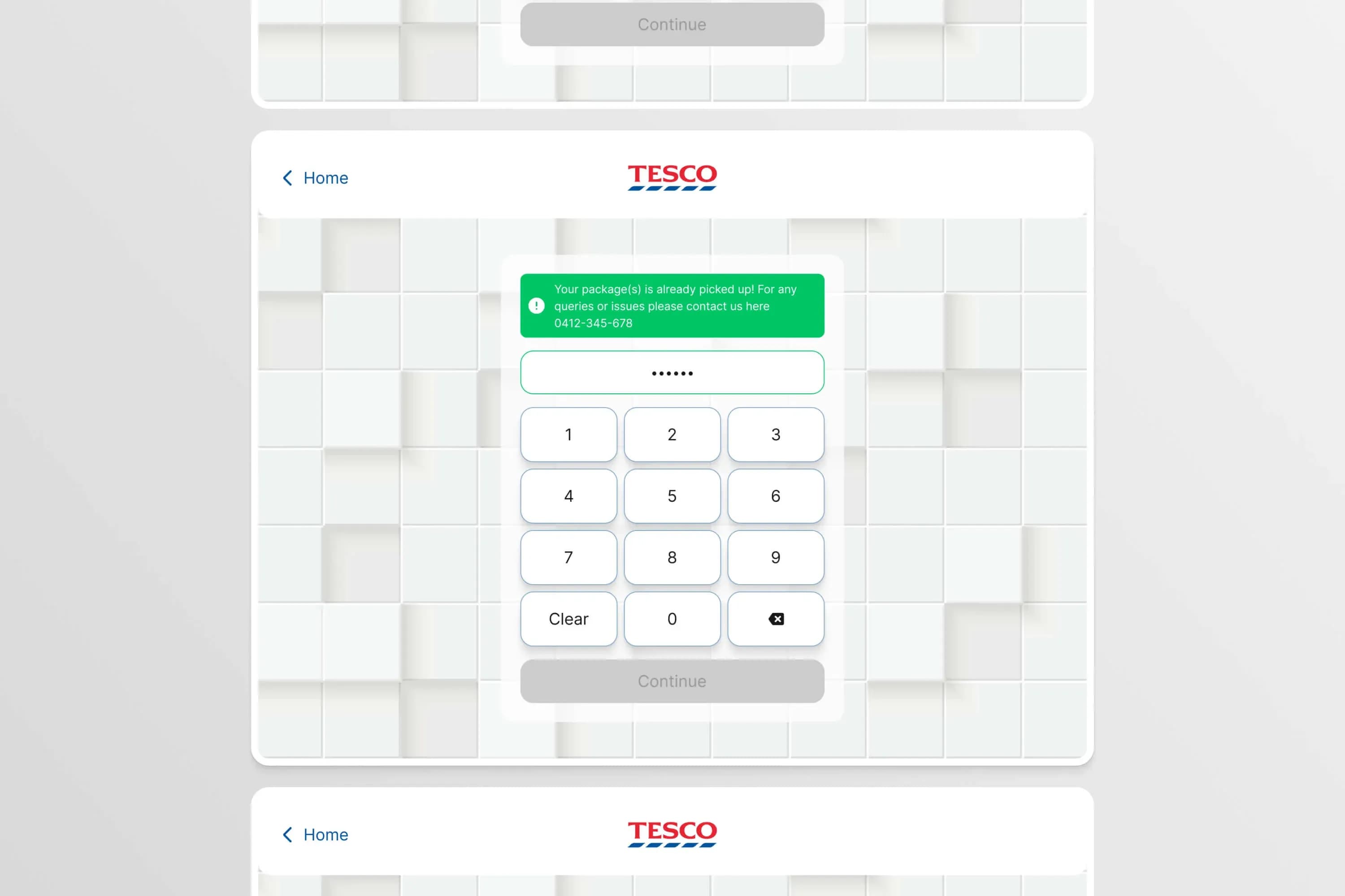
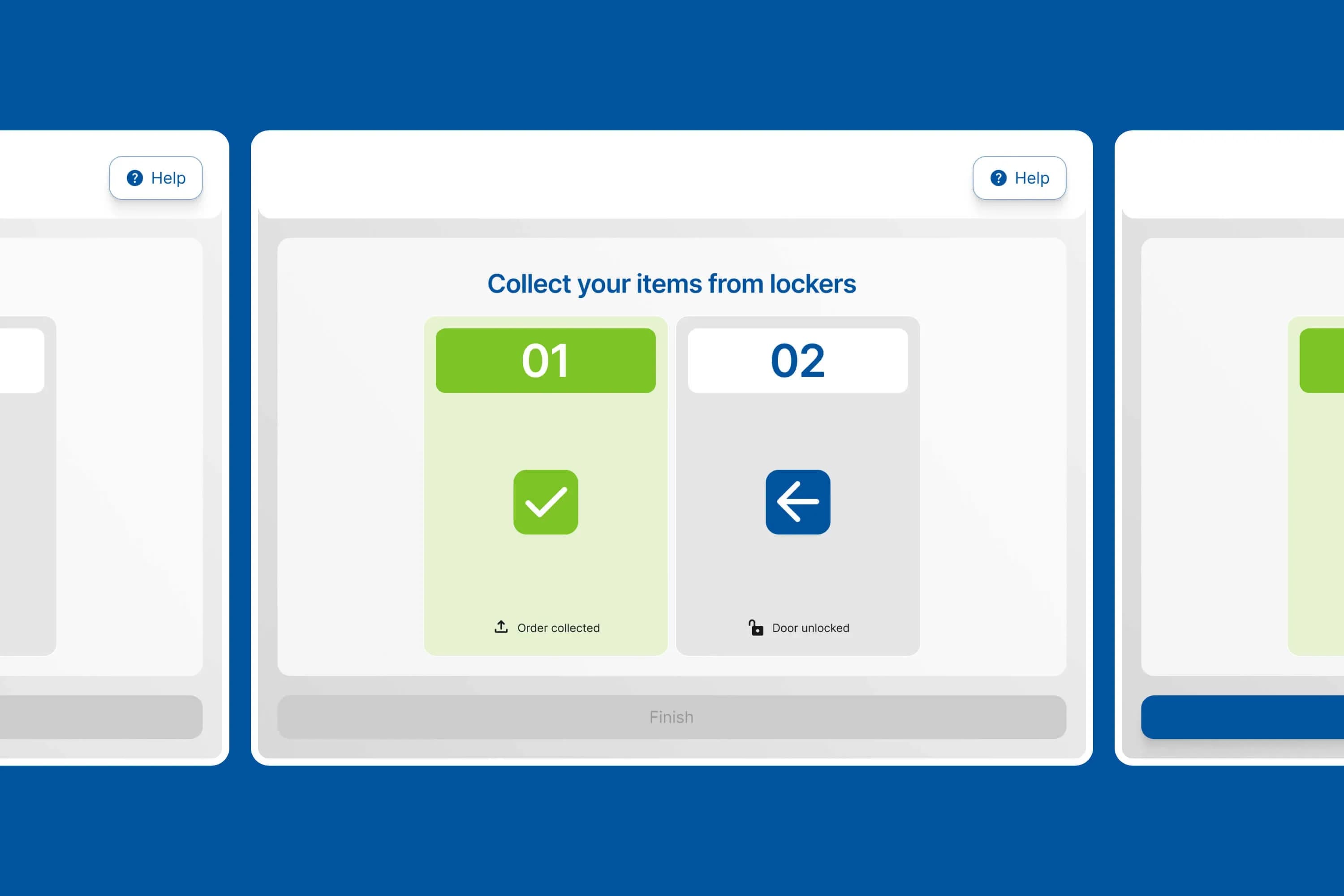
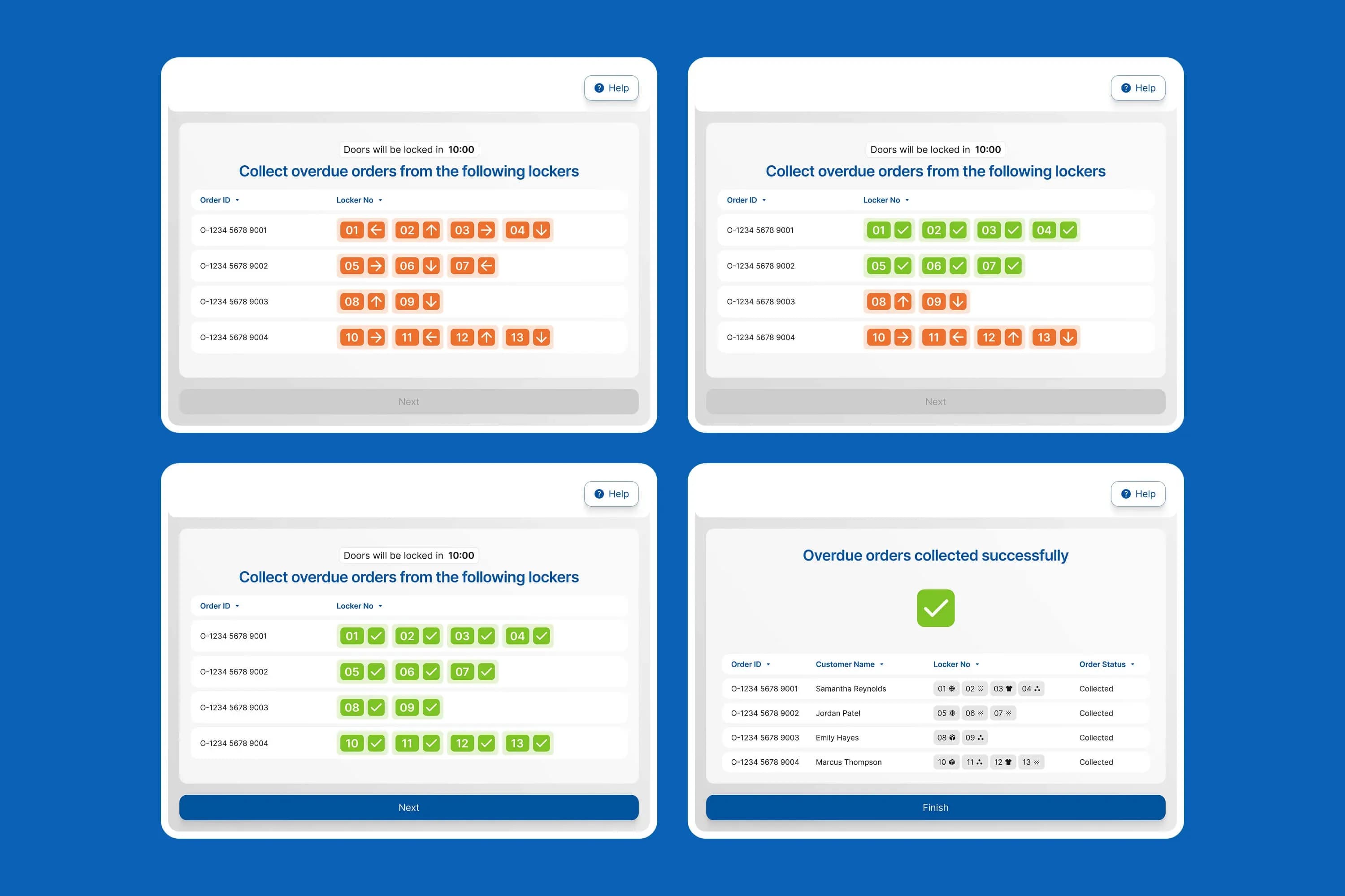
Complex logic flows across customer, courier, staff and admin left too much room for error.

Branding and sales materials didn't match the sophistication of the platform.

Accessibility gaps and inconsistent UI created friction and operational risk.

What We Did

One team, flows through to sales

Phase 1 - Mapping the logic

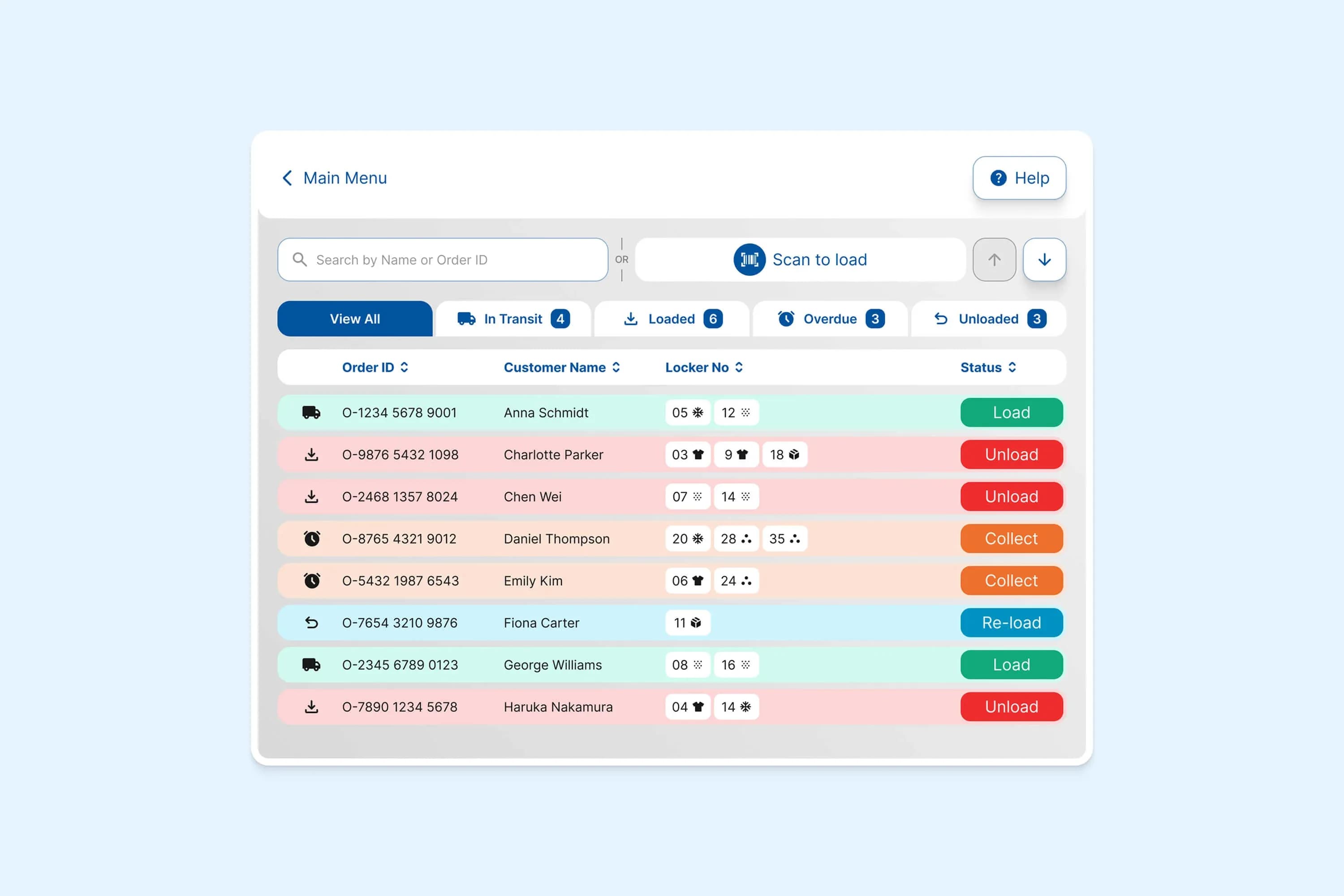
We untangled four experiences at once.

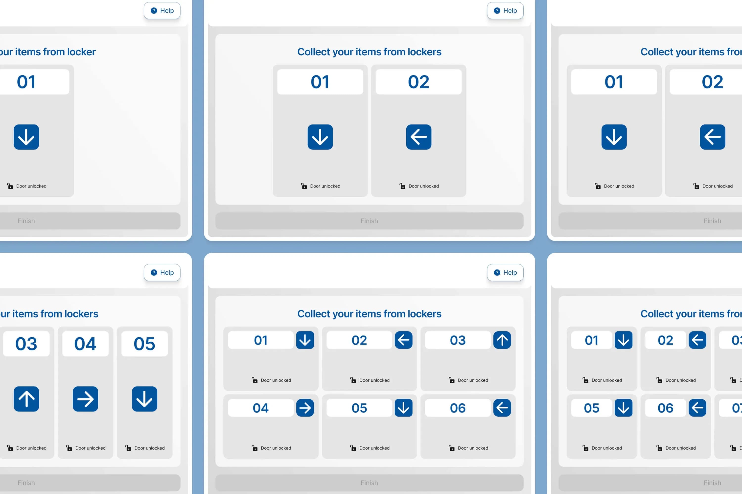
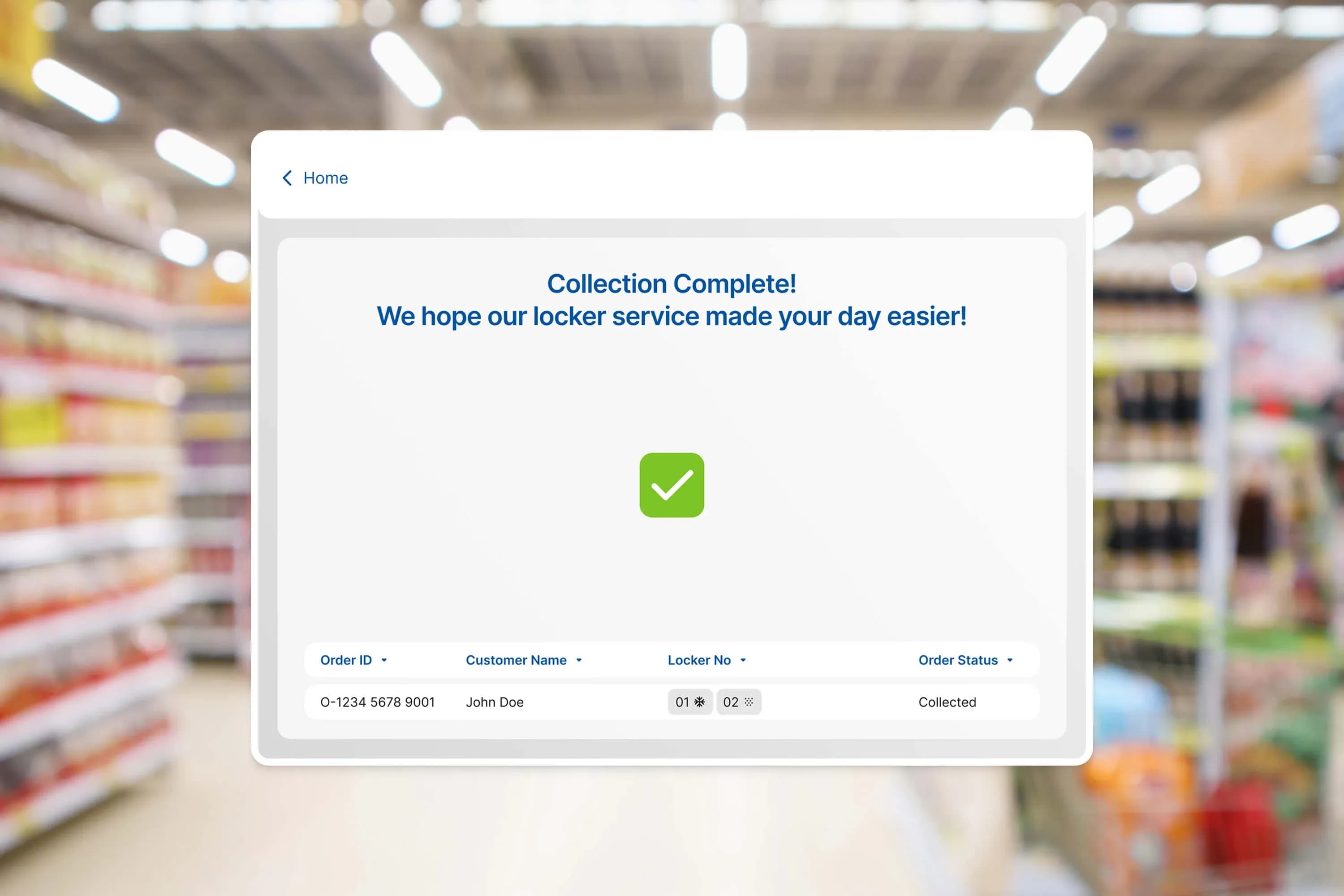
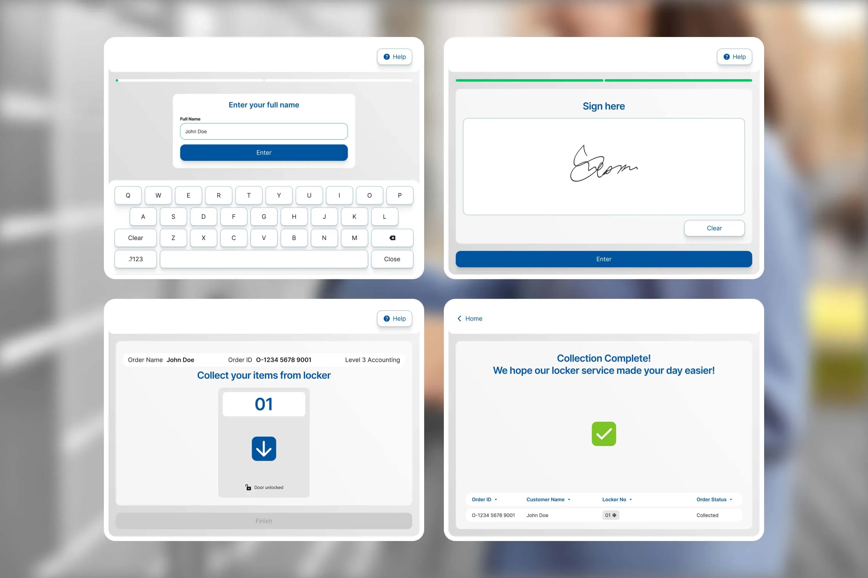
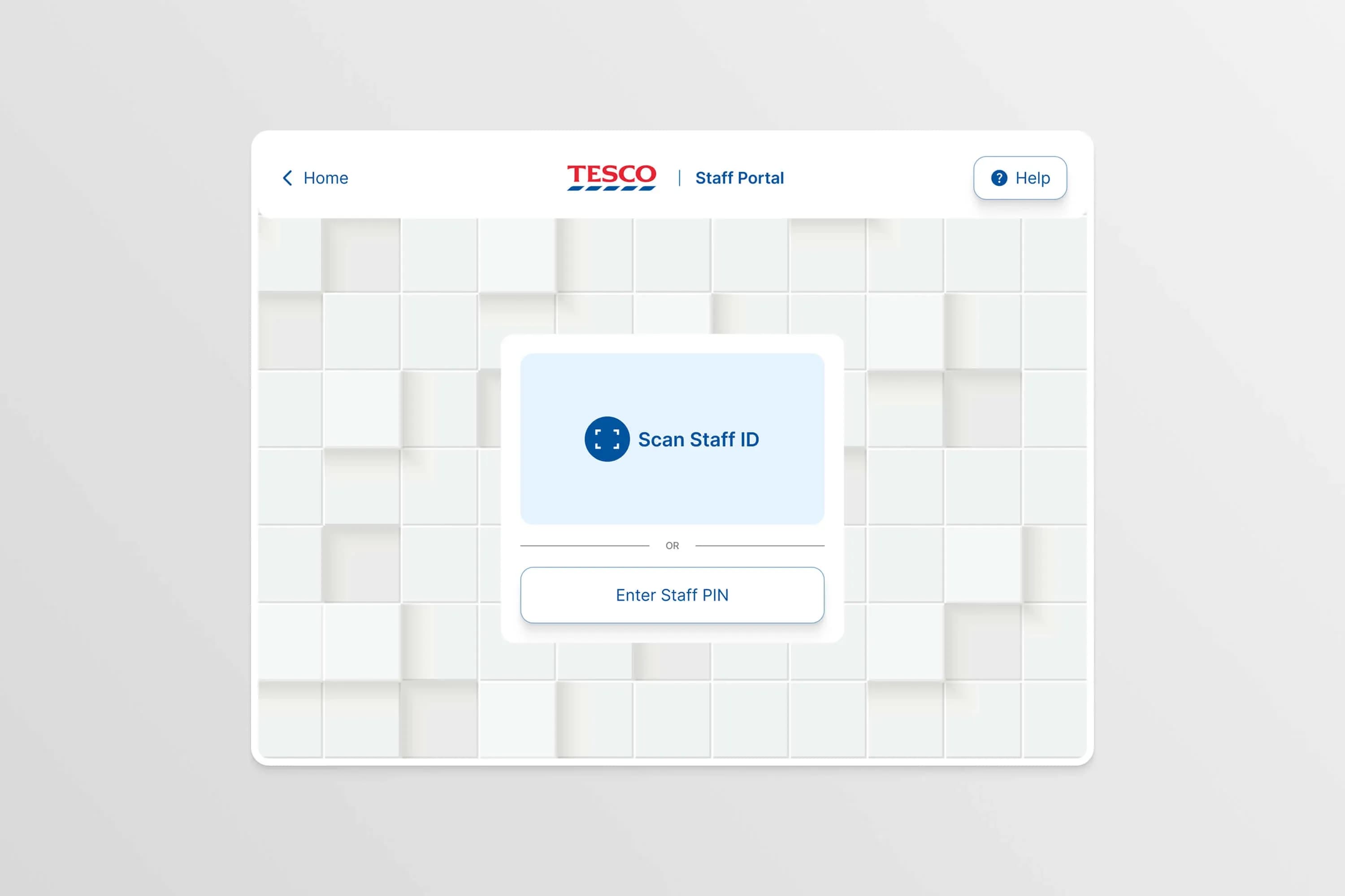
We started where the friction lived: the flows. We mapped the complex logic behind every journey across customer, courier, staff and admin, then redesigned each one around what that user actually needs to do. One product, four coherent experiences, instead of four competing ones.

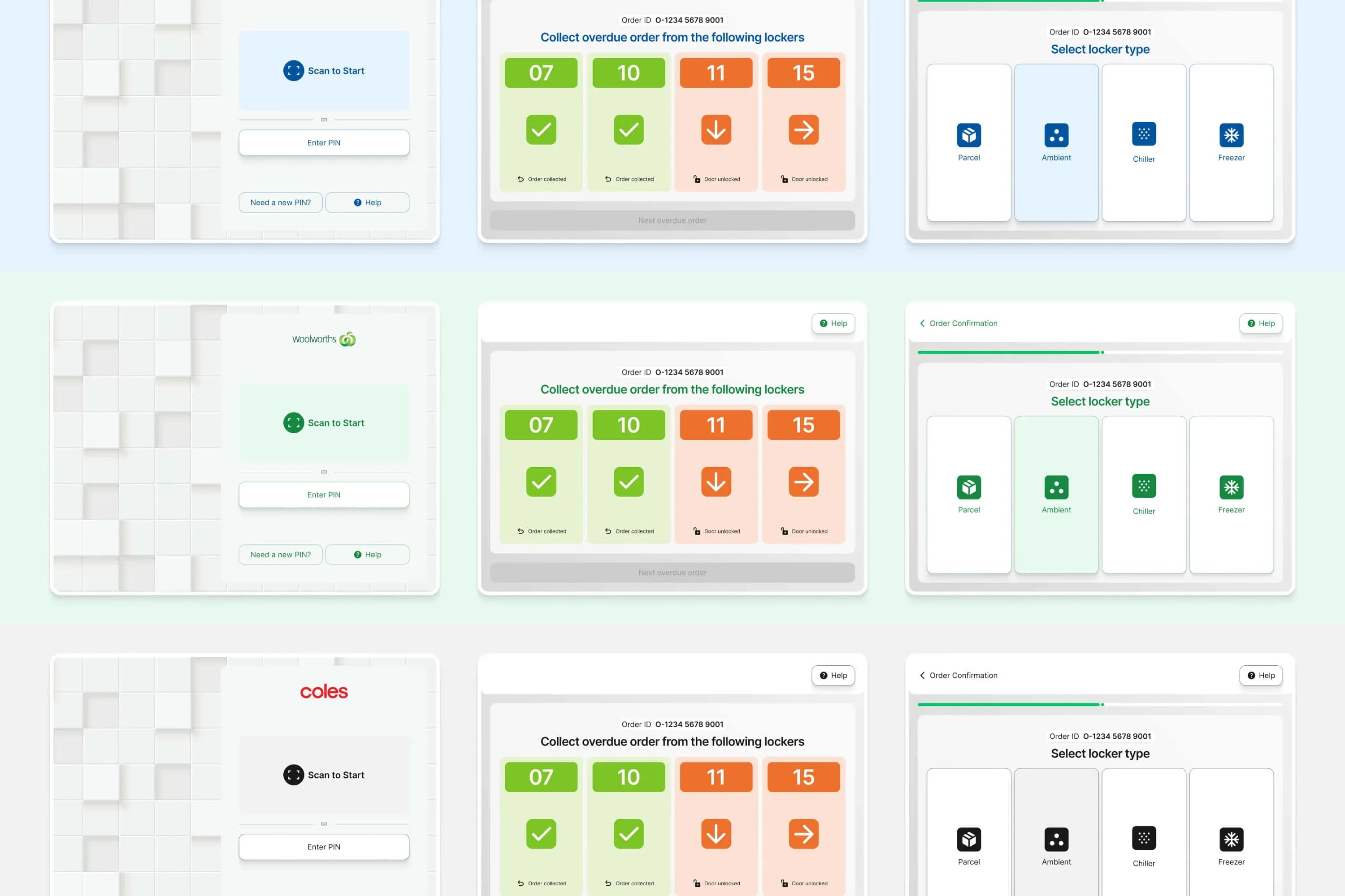
Phase 2 - A system, not a set of screens — A scalable UI built to grow.

On top of the redesigned flows we built a scalable UI system with accessibility designed in from the start, not bolted on afterwards. It gives Click n Collect a consistent product language across every screen and a foundation their own team can build on, so new features ship faster and development handover is clean.

Phase 3 - Making the value obvious — A website and CRM that sell the product.

A strong product still has to be sold. We designed and built a new website, produced buyer's guides, and set up an automated CRM campaign that spells out the product's value and use cases in plain terms. It gives the sales team stronger storytelling and gives stakeholders a shared, confident picture of what Click n Collect does.

Click n Collect
Click n Collect
Click n Collect
Click n Collect
Click n Collect
Click n Collect
Click n Collect
Click n Collect
Click n Collect
The Outcome

Clearer to use, easier to sell

01User experiences redesigned (customer, courier, staff, admin)
02Reduction in user friction / support load
03Scalable UI system enabling faster feature expansion
Operative Intelligence
Next Project

Operative Intelligence

Go to Contact pageSend us on WhatsAppEmail usCall us