Branding
- Personalised communications
- Brand strategy & positioning
- Visual identity & guidelines
- Content systems & architecture
- Brand strategy and frameworks
- Logo, motion, and asset design
- Persona research and brand audits
- Naming, content, and messaging
B2B Marketing
- Generate demand
- Increase sales
- Grow your digital presence
- Launch new products
- Integrated sales-marketing strategies
- ABM, demand and lead generation
- Campaigns, content, and outreach
- Marketing automation and tech
Digital Products
- Digitise your processes
- Improve customer experience
- Create new revenue streams
- Sustainable, accessible digital products
- UX/UI and product design
- Web, mobile, and app development
- Data, analytics, and integrations
- Emerging tech and platform builds
More
Visual Hierarchy: How to Create a Web Design that Grabs Attention and Keeps it
22 Aug 2021 | 4 min read
Want to know the science behind the art of user interface (UI) design? This article will explain the simple but effective ways to create visual hierarchy in both Web and App design, so your business can come out on top!


Some of us shy away from the creative side of marketing, leaving UI design to those with more artistic flare. However, there is a method to the madness.
The same way your knee jerks as a reflex to impact, or your mouth salivates to the smell of good food, so do your eyes have conditioned ways of processing information. The arrangement of visual stimuli determines what grabs your attention, in what order and for how long.
Bad news for human ingenuity: humans are predictable.
Good news for Marketers and Graphic Designers: humans are predictable!
So, what is Visual Hierarchy?
Simply put- the concept of visual hierarchy is about utilising the elements within a design composition to signify importance to the viewer. Through understanding the natural movements of the human eye, you can maximise the use of size, colour, contrast, alignment and pattern, to subtly orchestrate your viewer’s user experience (UX).
Five Key Principles of Visual Hierarchy:
1.Size
The larger the element the more likely it will be to grab audience attention first. Our gaze is naturally caught by the largest element, acting as a hook to reel you in. What to make big and what to leave small? This is answered by your unique branding strategy.
2. Colour
It’s all about finding the right blend. The brighter the colour the more likely it is to capture your eye. Think about the bright neon jackets you see bike riders wearing. Similarly, you should use colour in your Web design to communicate with your audience and signal a virtual “look over here!”.
3. Contrast
Our attention is caught by disparity. The sound of a fly buzzing is far more captivating when you’re in a silent room. By contrasting colour, style, texture and size you can guide your audience’s visual experience and create emphasis and meaning. You should use your brand identity to determine what elements to contrast and the meaning this will convey.
4. Alignment
Ensuring your design elements are consciously aligned creates order and ease for the user experience (UX). If your audience gets confused and overwhelmed by a messy interface, chances are you’ve compromised attention. So, make it easy for the viewer to stay engaged, keep margins aligned and consistent.
5. Hierarchy Patterns
Research has revealed two central hierarchical patterns with which we digest visual information: The Z Pattern and The F Pattern. As a graphic Web designer, you can maximise your audience’s aesthetic experience by adhering to these engrained visual patterns.
- The Z Pattern- In web designs that have multiple visual elements, our eyes scan between the main focal points. They dart from left to right, then diagonally down to the left, and so on and so forth. This is our eyes’ way of trying to effectively scan for the most relevant information.
- The F Pattern- In designs that are text heavy, our eyes follow a more traditional path of scanning left to right, then back down left to right. In the same way, we are searching for kernels of information that interest us.
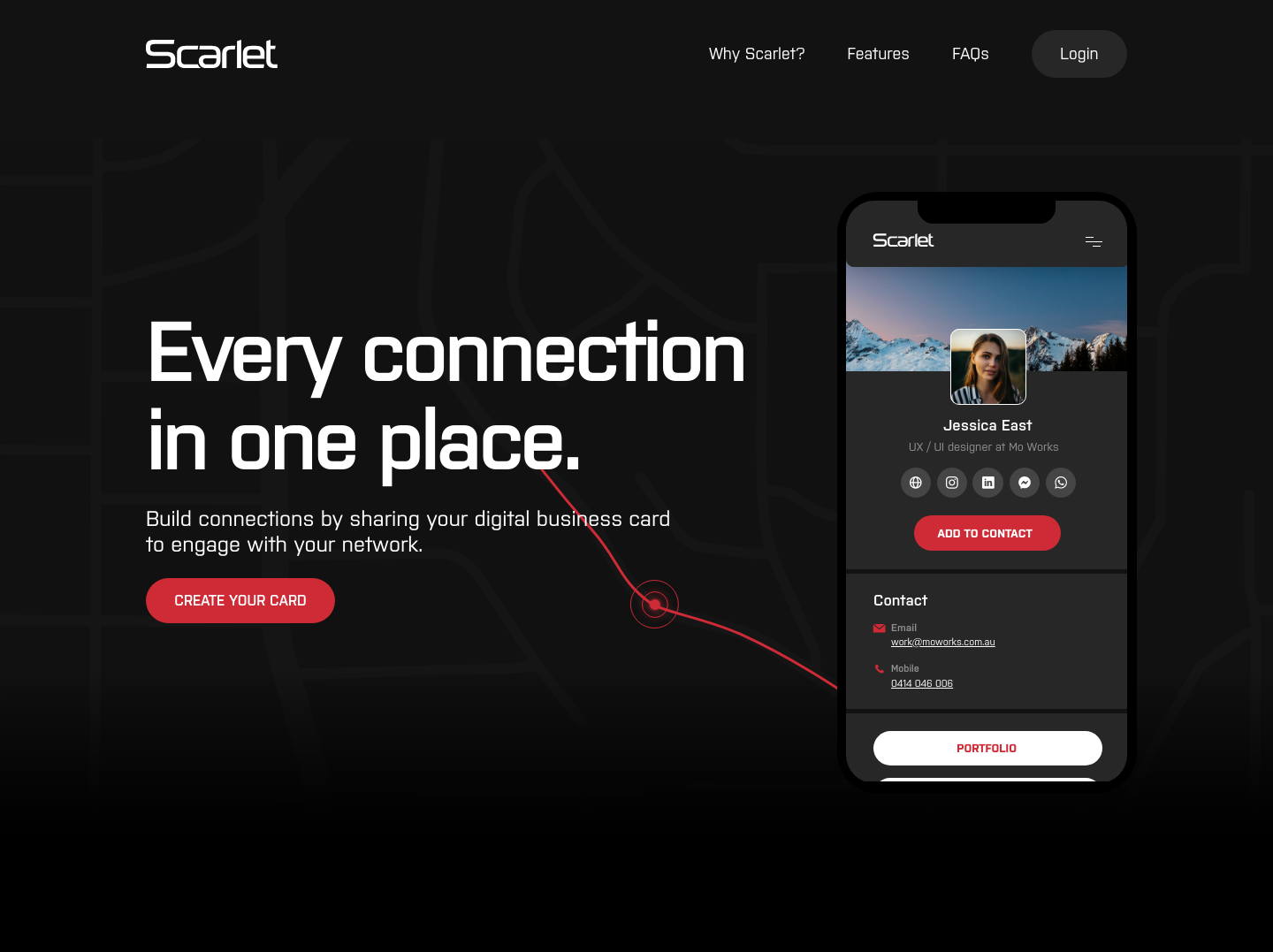
Here’s an in-house example of how we at Mo Works utilise the principles of visual hierarchy to redesign a UI for maximum effect:
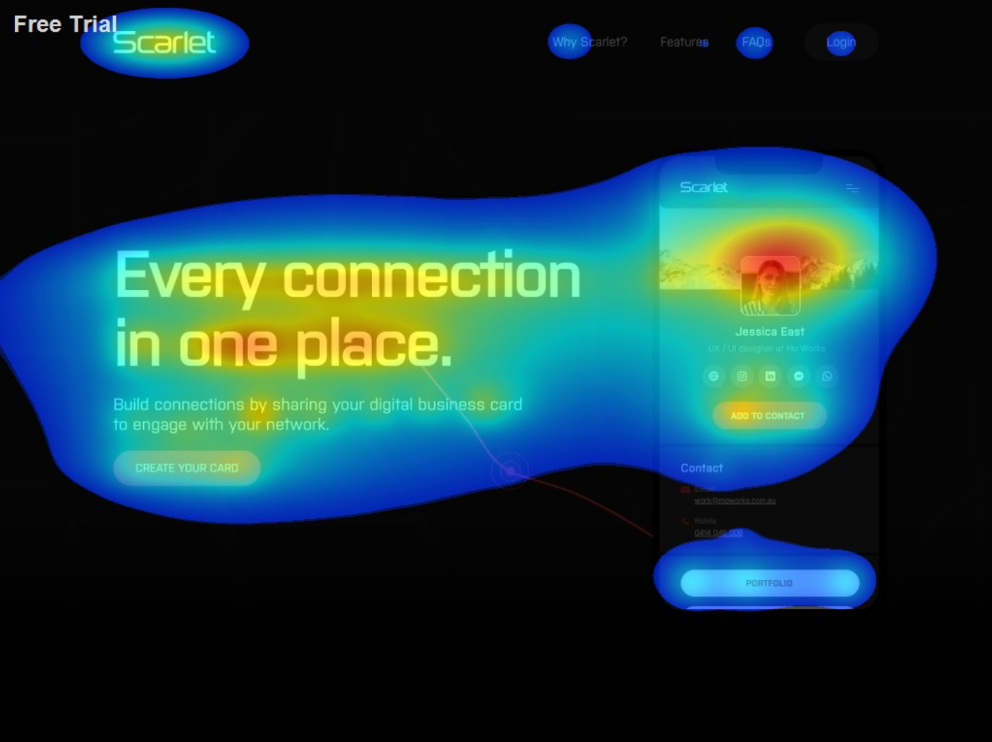
This radiographic example depicts a heat map of where the audience’s attention will be drawn to, with the red signifying key focal points.
Using pattern, size, colour, contrast and alignment, you too can be the silent orchestrator behind your audience’s interface experience. Through managing the principles of visual hierarchy in design, you can gently navigate how your audience sees your content and in what order of importance.
In a digital age where interaction is mediated by a screen, having a salient web design and UI design is essential for all businesses. At Mo Works, that’s what we do. If you need help maximising your website for optimal views, engagements and traction, get in touch with us!
Topics
Web Design
UI
UX
Visual Hierarchy
Share