Ultimate Guide For Creating A Successful App
**This guide is tailored to help the average startup/person make a successful app on a budget, with a focus on differentiating between what you can do with no app-making experience, and what you will likely need to have a third party help you with. Throughout, we’ll mention some of the key features of a successful app.**


Ultimate Guide For Creating A Successful App
So, you want to make a successful app?
It’s 2020, and mobile app usage has never been higher. With over 6,000 apps released to just the Google Play store every day, it’s becoming harder and harder to stand out from the crowd.
We’re writing this article for the aspiring or seasoned (we don’t discriminate) entrepreneur that already has a researched idea with an identified target market, and a basic idea of what their app is meant to do. We’re also keeping it simple–if you’re a professional UI/UX designer or app developer, chances are some steps that you believe are important may be missing.
Although it may seem daunting, following the steps in this guide will leave you with a much better app than the majority out there.
Overview
Here’s a quick breakdown of what we’ve run through below:
- List out user stories (template)
- Create user tasks
- Sketch out low-fidelity wireframes
- Make a low-fidelity prototype
- Conduct user testing
- Make a high-fidelity prototype (find a professional designer)
- Develop your app (find a professional developer)
- Optimise your app’s listing (template)
Part 1 - Stories, Tasks, Wireframes & Testing
List Out User Stories
As a < type of user >, I want < some goal > (so that < some reason >)*.
*The reason isn’t required but can be very useful.
This is a user story. It’s one of the common ways to map out what goals a user has when using your application, and serves as a way to communicate business logic (what your application needs to do) between non-technical, technical and design teams.
An example of a user story for a marketplace may be:
- As a premium member, I want to be able to list up to 20 items (so that I can sell more, faster).
Developing and designing an application can be expensive, and one of the most common reasons is trying to squeeze too many things in. Writing user stories will not only assist with communication in later steps but also refine the scope of your application.
Use these stories to help work out what functions are 100% necessary, and which are just ‘nice to haves’. Good developers and user experience (UX) designers will work with you and your list of ‘nice to haves’ to strike a balance between budget, UX and expectations.
“Good developers and user experience (UX) designers will work with you and your list of ‘nice to haves’ to strike a balance between budget, UX and expectations”
These are two example user stories from a recent flight reservation application we worked with:
- As a User, I want to be able to cancel my reservation/booking.
- As a User, I want to be able to choose between a 4 digit passcode, enable Face/Touch ID, or log in using the Fast.co passwordless plugin so that I can use my preferred method of login.
The second user story would definitely help users have a seamless experience, however, they don’t need to have 3 different ways to login to use the app’s core functionality: booking a flight.
List down every possible different story, for every type of user. You can choose to include or not include different user types in the same story (eg. As a Premium/Free User), but make sure to keep the action itself unique.
If this is your first app and you’re on a budget, try cutting out as many of those ‘nice to haves’ and putting them in a section for future updates. Really focus on the essence of the app, what the core functionality is, and what features are required to support that functionality. If you’re struggling with this, try downloading some popular apps and working out what their core functionality is vs. their ‘nice to haves’.
Here’s a user story template you can use, with a partial set of user stories filled as an example. If you’d like to use it, select File -> Make a copy!
Bonus tip:
We find including as many stakeholders(partners, investors, colleagues) as possible in this step can help not only refine the app’s features, but also align stakeholder expectations, which as an agency we’ve found invaluable on numerous occasions.
Develop User Tasks
A user task is more comprehensive than a user story, and will involve anywhere from one to many stories to complete. If you’re a keen gamer like Xiang, one of our rockstar front-end developers, you might liken a task to an in-game ‘quest’ with multiple steps to complete.
Structure these as an overall goal, with individual steps listed below.
Keeping with the ongoing theme of a flight booking app, here’s an example task with multiple steps:
Task: Find the cheapest flight from Melbourne to Sydney in December |
|
|
|
|
Each of these steps should correspond to one or two user stories, creating a chain of required functions. If there’s a step that you realise isn’t in your stories, go back and add it in!
Start with just making two or three core tasks that you think the average user might download your app to do. Why are these so useful? You’ll see why in the next two steps.
Sketch Low Fidelity Wireframes
You’ve now got a list of user stories and a few tasks prepared. The next step is sketching out some rough wireframes. You may want to rush into creating beautiful, high fidelity prototypes–hold up.
Low fidelity wireframes are designed to help you create an app that actually works, not one that looks beautiful. Best of all, they’re no design experience necessary.

A set of low fidelity wireframes–this is about as much detail as you need
While writing this, I asked Clem, one of our designers, to describe what the most useful aspect of a low fidelity wireframe is. The first thing she said was this:
“Low fidelity wireframes are like the floorplan an architect would draw before building a house. They are essential to a smooth building process.”
“Low fidelity wireframes are like the floorplan an architect would draw before building a house. They are essential to a smooth building process.”
First, download and use other similar apps. What did you like about them? How did they handle menus? Were there any parts you found frustrating? Did you find navigating them intuitive? How did they handle data entry? What else is notable about their interfaces? How did they handle information hierarchy?
Congratulations, answer these questions and you’ve conducted UI research. Document your actions, take screenshots and note down how you felt using the different interfaces. If you had no clue where to start with your wireframes before, you should now be starting to form an idea.
Once you feel like your idea is starting to flesh out, grab yourself a sketch pad or a whiteboard and start sketching out basic layouts. Don’t include content, and definitely don’t include colours. Unless you have design experience, we’d recommend doing this offline to avoid investing too much time. Don’t be beholden to your first design, and don’t be afraid to start again. A key part of the design process is iteration. Design, design, and design again.
“Don’t be beholden to your first design, and don’t be afraid to start again. A key part of the design process is iteration.”
Use your list of user stories to make sure that your wireframes cover all the different possible ways a user may want to use your app. Pretend to complete your core user tasks, making sure that following the steps is not only possible, but also intuitive. Don’t sweat the little things yet though–save that for the next step.
By the end of low fidelity wireframing, you should have a collection of rough sketches detailing what screens you’ll need, and how content is going to be displayed.
Bonus tip:
When it comes to low fidelity wireframes, less is more. The higher fidelity you design, the more crowded everything will seem. The fewer screens, widgets and buttons your user has to navigate through to complete a task, the better UX your app will have. Don’t bombard your user!
Low-Fidelity Prototyping & User Testing
There’s one more key step that should be completed by you if you want to make a successful app on a budget: user testing.
User testing lets you see how your app functions out in the wild, as well as catch any important features or functions you may have missed. It’s vital to complete before moving towards development, because making changes and adjustments afterwards to software architecture suddenly become exponentially harder.
Remember your user tasks? This is where they’ll really shine. You’re going to ask friends, family, colleagues (really anyone indicative of your target users) to test your designs.
Naturally, your wireframe sketches aren’t going to cut it. You’re going to need a simple, interactive prototype with basic information.
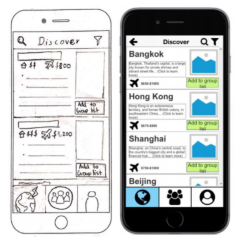
A rough wireframe sketch vs a low-fidelity interactive prototype for a fictional travel planning app. Note how the images are left as placeholders, but some placeholder text is provided.
There’s a wealth of free tools online like balsamiq and Axure. If you have access to Adobe Suite, Adobe XD is our designers’ tool of choice for prototypes. Don’t spend too long making these perfect. They’re for testing purposes only, and if prototypes look too close to a finished product, test subjects will likely leave feedback on design/colours instead of what you’re testing for, i.e usability.
Once you have a working, interactive prototype, prepare your user tasks as a set of instructions. Here’s an example:
 |
One of the tasks used in user testing for a (fictional) travel planning app. Notice how the user is given a small amount of context and information, and left to ‘intuitively’ work out what specifics are required to complete each step.
|
Give users your tasks and watch how they complete it. Don’t say anything unless they’re really, really stuck–watching how they stuff up without your input is indicative of how a real user would act.
What did your user find difficult? What parts did they like? If your user testing is happening on a computer, record your user’s screen and go back through it afterwards. We also find it valuable to ask our test subjects to ‘think aloud’. Hearing “Hmmm, I’m looking for where to add a flight but can’t see it”, or “oops I thought this button would take me somewhere else” is invaluable for future design iterations.
Wait, more design iterations? Surely you can’t mean redesigning everything? Unfortunately, that’s exactly it. Great, usable, human-centric designs come from iteratively testing, improving, testing, improving. As IDEO put it so succinctly: “Testing, getting feedback, and iterating will help you get a great solution to market and let you know where to push it when you do”.
“Testing, getting feedback, and iterating will help you get a great solution to market and let you know where to push it when you do.”
Once you’re comfortable that your design is intuitive, has all of the required functionality (double-check your user stories), and can complete all of your tasks–congrats! You will have likely put a huge amount of effort into this, and you should be proud.
Bonus tip:
Users care about first impressions. A lot. Mobile app insights have shown that only 33% of people keep an app 3 days after their initial download, and within 30 days that’s down to 10%.
Spend some time during your user testing thinking about what might help new users opening your app for the first time. We’ve found 3 or 4 screens simply explaining how users can complete your primary 1-2 tasks often works well.
Part 2 - High Fidelity Design, Development & Listing
You’ve researched, conducted user testing, iterated, and hopefully come up with a working and usable prototype. Next, get some professional help. Sorry to put it so bluntly. You’ve done all you can, and believe us it’s a lot more than most. The good news: whichever route you choose to take after this, you’ve likely minimised your costs.
Whether it’s hiring in-house designers and developers, or outsourcing your app to an agency, if you want to make a successful app you’ll need someone with experience for these next few steps.
High Fidelity Prototypes
High fidelity prototypes should look exactly like your finished app, and should be nearly fully interactive. This means colours, content, images, everything. These are in a format that makes it easy for anyone (especially developers) to get an instant ‘feel’ for the app by navigating through your screens, pressing different buttons and doing really whatever they want.
Depending on where you are in your business journey, creating this prototype may involve developing a full brand including colours, personality, logo and design assets. You’ll also want to consider developing other documents in tandem like language guidelines to ensure content consistency (eg. does our brand use contractions, and do we ever make puns?).
Regardless, it’s a good idea to hire or outsource a designer to make sure your high-fidelity prototypes are in tip-top shape before passing them onto development.
Bonus tip:
Finding a design+development team can save you a lot of stress and money in the long run. Acting as a single point of contact between the two different teams can become very time-consuming (i.e expensive), and will often suffer from ‘Chinese whispers’.
Develop Your App! (Finding a Developer)
If you have a background in app development, woohoo. You don’t need us here. If you’re like the rest of us and haven’t developed a mobile application before, this step can be the most daunting. There’s a lot that goes into a successful app including analytics, integrations, animations, and even just getting it listed on the App Store or Google Play.
If you’ve invested time and money into your business, one of the surefire ways to create an unsuccessful app is by trying to do it yourself with an online ‘no coding required’ tool. Unless your app is incredibly simple (maybe a to-do list?), these won’t be able to handle the required functionality. You’ll quickly find yourself making compromises across every area of your app to fit within their framework.
We unfortunately don’t have enough time to teach you how to develop a successful app. The internet is big and full of free and paid resources–but be aware that without previous experience it will take anywhere from 6 months to many years to learn.
For this reason, we have zero guilt suggesting you have this done step done by an experienced professional or team.
The good news is this: with user stories, wireframes and high-fidelity prototypes prepared, you’re able to provide your chosen developer with everything they need to realise your vision. Remember: communication is the most important part of this step. We’ve seen too many apps fail due to something important being missed when communicating requirements to the development team. It often feels like they speak a different language, so make sure to find someone willing to put effort and time into communicating with you.
Bonus tip:
You may consider going to Fiverr or Upwork where app development can cost anywhere from $5 - but you get what you pay for. If you go cheap on development, chances are you’ll get a modified code template that the seller may not own the license for and likely won’t maintain for you.
If your app involves payment processing or handling sensitive details, it’s even more important you work together with a credible and transparent developer to ensure that you and your users aren’t the victims of security vulnerabilities or malicious code.
Submit and Optimise Your Listing (for Google Play and the App Store)
You’ve got your app. It runs smoothly. You’re feeling a mixture of love/appreciation/gratitude for the magnificent mobile app beast that will carry your business to the promised land of 10x. All that’s left now is making a great listing on the app store. Easy? It can be. But it’s hard to do well, and so, so important.
Similar to SEO (Search Engine Optimisation) for Google, you also have to make sure your app is optimised for users searching in either the Apple or Android stores. If you don’t, you’re wasting organic leads from users searching for an app just like yours.
Top results are based on a mixture of relevance, ratings, popularity, and some more behind-the-scenes magic that changes on a regular basis. Although ratings and popularity will be dependent on the app itself, you can make sure you give your app the best shot at being found by nailing the ‘relevance’ part of your listing.
You’ll need to work together with your developer to list your app, or pay for your own developer account on both stores ($99/year for Apple’s App Store, $25 once for Google Play).
In essence, for each store listing you’ll need a:
- App launcher icon
- Title (and subtitle for the App Store)
- Keywords/Tags
- Description
- Screenshots of your app
Our digital marketing Guru Vani put together an app description template that we use for our simpler app listings. You’re welcome to use it (Use File -> Make a copy), just send us a thank you message if it helped!
App Launcher Icon
This is the classic square app image users will see when they download your app. It’s also used to show your app in both stores.
Title
Many apps’ names don’t immediately give away what they do. A great example is an app we developed, Zukaz. To combat this, many apps include what they do as part of their titles. for example “Zukaz: Hunt Cash Vouchers In AR”.

Although many of these apps’ names aren’t ‘flight’, they deal with some aspect of ‘flight’ and have included it after their name for search optimisation.
Think about what information you can fit in your title while remaining under the character limit (you can find these in the spreadsheet). This can make or break your store listing.
Keywords/Tags
Choosing good keywords is a form of art. They have to be popular and relevant, but not too popular. Broad enough to maximise reach, but narrow enough that you don’t have to compete with the big guys. The rules are always changing, but luckily there’s a tonne of resources you can find through Google. We’re thinking about making a guide–check back soon!
One tip we can give you: keep your most relevant keyword(s) consistent across your title, keyword section and description. This has a huge impact on search results, and should help your app show up for those specific keywords unless the competition is fierce.
Description
You can make these the same across both stores, but be aware that keywords are treated differently in each. Our spreadsheet has the details.
There’s no real recipe to a great description. It depends on what your app is, and who you’re trying to appeal to. Search through top apps and see how they’ve structured their descriptions. We’ve found what works well is quickly and succinctly highlighting:
A)what your app can do, and
B) why it does it better.
Screenshots
These can be a bit of a hurdle, and you will most likely receive one or two of these while trying to get them set up:

Apple and us go way back
Work with your design team to choose screenshots that look great and reflect your app in use (a fairly vague specification, we know). If your app works on other devices like an iPad, you’ll also have to provide screenshots that match those specifications. You can find the specifications for Google Play here, and for the App Store here.
And you’re done! Feel free to reach out to us, the Mo Works team, if you have any questions, need a hand, or just want someone nice to chat with.
Topics
app
interface
app development
starting
mobile app
success
tips
process flow
key features
app developer
designer
keywords
Share